Quantcast
Channel: Printmaking – Jackson's Art Blog
Viewing all 92 articles
Browse latest View live

Collagraph Print Making by Suzie MacKenzie

$
0
0

Much like the landscape in the Northern Highlands in which the artist lives and works, there is something very rich, lush and textural about Suzie MacKenzie’s prints. The textures and dynamism of the work is largely thanks to the technique of collagraph that she uses. Suzie has exclusively shared her experiences of collagraph technique on the Jackson’s Art Blog.

Collagraph is a relatively recent and very versatile print medium with no need for expensive or hazardous materials.  It can be printed either in relief or intaglio, or in a combination of both techniques; but for me its main appeal is the richly atmospheric results that can be achieved through intaglio printing.  The name was first coined by the American artist Glen Alps in the late 1950s, and reflects the fact that it is a print made from ‘collage’.

Suzie MacKenzie's studio

Suzie MacKenzie’s studio

My own collagraphs begin life as photos which I alter using a photo-editing software program.  This may involve moving, removing or adding features, stretching and resizing, until I reach a composition that I’m happy with and that I think conveys the ‘feel’ of the image as I originally experienced it.  I then convert the image to black-and-white which I find makes it easier to begin to turn it into a collagraph, and reverse it so that the final image will be the right way around when printed.

I transfer the reversed image onto the plate using tracedown paper.  I use mountboard plates with the edges bevelled (usually the ‘middles’ that have been cut out when framing work).  I find this ideal as it can be cut and peeled into as well as having textures stuck onto it; it has the added benefit of being recycled!

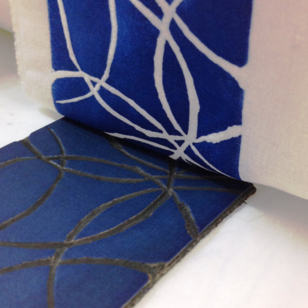
When constructing a collagraph plate it is the texture of the collage that will dictate how it prints; if it’s printed using the intaglio method, rough surfaces will hold the ink and print dark; shiny or smooth surfaces will wipe clean and print light or barely at all.  With mountboard, the unaltered surface prints in a mid-tone; when the top layer or two is cut and peeled away(I use a scalpel for this) a rougher surface is revealed that will print dark.  To get a complete range of tone I also apply PVA glue or adhesive tape which prints light, and for a dense black, fine carborundum grit or sandpaper.

Suzie MacKenzie: Taking a rubbing from a collograph plate-in-progress to get an idea of what a print from it would look like

Suzie MacKenzie: Taking a rubbing from a collograph plate-in-progress to get an idea of what a print from it would look like

Other textures can also be applied – I like to use handmade papers with inclusions, but more-or-less anything flat enough that can be adhered to the plate and put through the press without damaging it can be used, including fabrics and plant material.  In fact the very slightest ‘edge’ will hold ink and print.  I’m always surprised by how the tiniest alteration in texture – from a careless fingerprint on the edge of a sealed plate that’s not quite dry, to a stray cat hair caught in the varnish – will feature prominently in the finished print!

I work into the plate cutting and peeling, and applying cut shapes of different textures using photo spray mount, trying to match textures and how I know they will print to the tone in the original.  Lines and other marks can also be scored or cut into the plate and its textures.I take frequent rubbings from the plate using newsprint and a thick graphite pencil which gives me some idea of how the composition is working, never forgetting that this gives a reversed image.

When I’m happy with the finished plate I seal it, first with dilute PVA which I find helps adhere the various elements to the plate, and then when this is dry with a coat of spray polyurethane varnish.  This stops the ink from soaking into the plate and makes it easy to clean.  After a couple of days the sealed plate will be dry enough to print from.

Suzie MacKenzie: A finished plate - ready for printing!

Suzie MacKenzie: A finished plate – ready for printing!

I print my plates using the intaglio method, so I ink up with extended etching ink, often in one colour only (I prefer a darkened Prussian Blue but this will depend on the subject of the print), then wipe with scrim and pages from an old phone book; the print is taken using a high-pressure etching press and dampened paper.

Suzie MacKenzie: Wiping the plate

Suzie MacKenzie: Wiping the plate

This process forces the paper into the cut lines and textures to pick up the ink left after wiping and also renders the textures used in making the plate.  The damp prints are then stretched on boards with their edges taped so that they dry flat.  Colour can be applied in many different ways – for example the plate can be inked ‘a la poupee’ in different colours; a contrasting colour can be rolled over the top of the intaglio inking; chine collé (coloured lightweight papers adhered during the printing process) can be used; or the dry print may be hand-coloured.

Suzie Mackenzie: The inked up plate

Suzie Mackenzie: The inked up plate

Finally, each dry print is signed, titled and numbered, most with the designation ‘VE’ showing that it is from a varied edition.  I make very small varied editions from my plates, rarely as many as ten and often as few as three.  This is partly because the plates begin to degrade relatively quickly under pressure from the press, but also because I like to experiment with different inkings, wipings, colours and chine collé additions; each print I make is a step in the learning process and I’m always looking forward to applying what I’ve discovered to the next.

Suzie MacKenzie: Flood in  the Strath, Hand coloured collagraph, varied edition of three, 57cm x 26cm

Suzie MacKenzie: Flood in the Strath, Hand coloured collagraph, varied edition of three, 57cm x 26cm


Suzie’s website can be viewed at http://www.mackenziefineart.co.uk

Suzie MacKenzie will be exhibiting at the following exhibitions in 2014:

Showcase artist, Timespan, Helmsdale. From 28 March thoughout 2014.
International Open Mini Print Exhibition, Seacourt Print Workshop, Bangor, Northern Ireland. 1 – 31 May.
Latheron Art Show, Latheron Hall, Caithness. 23 – 25 May.
Tenth Anniversary Members’ Show, An Talla Solais, Ullapool. 19 July – 31 August.


The post Collagraph Print Making by Suzie MacKenzie appeared first on Jackson's Art Blog.


A Coffee Break with Printmaker Anita Klein R.E.

$
0
0

Whilst exploring the exciting world of printmaking at university, there were a few printmakers who repeatedly caught my attention at various exhibitions at the Mall Galleries and the Royal Academy Summer Exhibitions. One of these artists was Anita Klein R.E., whose images of contented figures engaged in everyday activities always seemed pure and simple – imagery that brought warmth to the heart and had none of the supposed ‘intellectual challenge’ that the YBAs presented (another group of artists who also repeatedly caught my attention at this time). In many ways Anita Klein’s work is more challenging to many – so many have a problem with art that celebrates simple pleasures, and gives us aesthetic pleasure too – where is the idea? Well, the idea is right there, staring us in the face, brought in the form of wonderfully bold compositions and sensitive palettes. Anita generously gave her time to answering some of my questions about her life as an artist.

Anita Klein R.E.

Anita Klein R.E.

Lisa: What first attracted you to trying your hand at printmaking?

Anita: Half way through my undergraduate degree at the Slade, I became bored with the abstract paintings I had been making since my foundation course, and returned to the figurative, autobiographical drawings that I had always done as a child. Paula Rego, who was a visiting tutor at the Slade at the time, was experimenting with printmaking herself, and she and Paul Colwell, who was the print technician in the postgraduate printmaking department, encouraged me to try printmaking using my new drawings as subject matter.

Lisa: Where do you find inspiration for your images?

Anita: My everyday life and my dreams.

England in the World Cup by Anita Klein R.E. Drypoint - edition of 25

England in the World Cup by Anita Klein R.E.
Drypoint – edition of 25

Lisa: How do you go about designing your compositions?

Anita: Composition, by which I mean the design of the picture, where it begins and ends at the edges, and the shapes that make up the image, is extremely important to me. The more tightly and carefully designed the internal space is, the less fleeting and more of an object the painting becomes. When I draw as preparation for a print or painting I use an eraser as much as I use a pencil, constantly correcting until I feel everything settle into a stillness, a bit like putting the last piece in a jigsaw. I don’t expect people to necessarily notice this about my work; I want it to seem simple. But I do hope that my quest for pictorial harmony means that people feel soothed and calmed by the end result.

Lisa: How do you decide when to use colour, and which colours to use?

Anita: I don’t make any conscious decisions about colour in my paintings. I distract myself by listening to the radio and the colours just “happen”. I use the colours in a painting as a starting point for colours in prints, but I have to modify them as printing inks mix with each other in different ways when they are printed on top of each other.

'Shadows in the Forest' by Anita Klein Linocut - edition of 100

‘Shadows in the Forest’ by Anita Klein
Linocut – edition of 100

Lisa: Do you have a favourite printmaking technique?

Anita: At the moment I am exploring the possibilities of linocuts and lithography. I used to use drypoint as a way of keeping a visual diary. I like simple direct processes best, but I choose which technique to use according to which type of mark best suits the emotion I want to express.

Lisa: What do you hope to communicate in your work?

Anita: If I could say that in words then I would use words.

Lisa: What is the biggest frustration you can face in your studio and how would you overcome it?

Anita: Interruptions and admin are the most difficult part, but they are only to be expected as I am lucky enough to make a living out of selling my work. So I work for one week every month in Italy so I can paint and try new things without distraction.

Lisa: Who are your favourite printmakers?

Anita: Picasso and Rembrandt.

'The Linden Tree' by Anita Klein Linocut - edition of 50

‘The Linden Tree’ by Anita Klein
Linocut – edition of 50

Lisa: Is there a link between your printmaking work and your work in other media (paintings/stained glass/sculpture)?

Anita: Sometimes I work in other media just to loosen up and try something new. It’s good to use techniques that you’re not practised at. That’s how the best happy accidents happen. All my work is connected.

Lisa: What plans do you have for the near future and where can we see more of your work (online or in the flesh)?

Anita: I have a few exhibitions planned this year, and will probably have a solo show of new paintings in 2015. You can see my work on my website; www.anitaklein.com as well as a listing of galleries and forthcoming exhibitions. Eames Fine Art and the Bankside Gallery in London have the best stock of my work. I also welcome visits to my London studio if they are arranged in advance.

'The Birthday Gift' by Anita Klein Woodcut - edition of 50

‘The Birthday Gift’ by Anita Klein
Woodcut – edition of 50


Anita Klein will have prints at the London Original Print Fair with Eames Fine Art, Advanced Graphics London and the Royal Society of Painter-Printmakers. She will also be giving a talk about her work at the London Original Print Fair at the Royal Academy on Sunday 27th at 3pm – more information at http://www.londonprintfair.com/events. People can book the talk in advance by e-mailing rsvp@londonprintfair.com.

What do you think of the work of Anita Klein? Please let us know by commenting below! 

To view the printmaking department at Jacksonsart.com click here

The post A Coffee Break with Printmaker Anita Klein R.E. appeared first on Jackson's Art Blog.

10% off Printmaking Supplies

$
0
0

Nearly all your Printmaking Supplies

In the run up to the London Original Print Fair which takes place on April 24-27, 2014 Jackson’s have been publishing a series of articles about artist printmakers. And now we are having a special offer on nearly all our printmaking department! Whether you use screenprint, etching, linocut or woodblock we have the tools and materials you work with on offer now! Offer ends on May 11th.

10% off a large selection of items in the Printmaking Department

Screen Printing tools and inks
Etching tools and inks
Lino and Block Printing tools and inks
Selected Printing Presses
30% Off Jackson’s Academy Print Rack


printmaking supplies

Pfeil lino and wood block cutters for printmaking


Click on the offer link to go to the printmaking supplies offers on the Jackson’s Art Supplies website.
Postage on orders shipped standard to mainland UK addresses is free for orders of £39.

The post 10% off Printmaking Supplies appeared first on Jackson's Art Blog.

Easy Creative Linoprints with Schmincke Inks

$
0
0

Do more of what makes you happy!
Make linoprints in an easy and creative way with Aqua Linoprint colours from Schmincke.

A Workshop for easy printing techniques with Susanne Goch

Have you ever wanted to print pictures, postcards or letters with linoprint colours but you were afraid of difficult cutting techniques with hard linoprint plates remembered from school days? Schmincke now have a simple, non-complicated and nevertheless professional alternative: linoprint with soft printblocks and brilliant Schmincke Aqua Linoprint Colours based on a natural binder – gum-arabic, the same binder used in watercolour paints – rather than a synthetic binder.

All techniques like black-line or white-line prints, multicolour prints, letters, postcards, or pictures are easy to realise and have an amazing handmade touch.

You will need:
• A fine pen
Tracing paper
• Pictures or letters for ideas (photos, text, drawings)
• Printblock made of soft gum like our SoftCut Lino
Lino cutters in different sizes
Schmincke Aqua Linoprint Colours of your choice
• Plate made of glass
Print roller
• Smooth, heavy paper, like Hahnemühle Nostalgie or heavy cartridge paper (white or coloured)

lino01

Step 1: The design and its pre-drawing

First you have to sketch a pre-drawing with your pen on transparent paper (and not directly on the printblock!). Decide whether you’d like to create a blackline-print (cut out, without background) or a whiteline-print (print of cut lines).

lino02-

Step 2: The transfer onto the printblock

Put your pre-drawing upside down on the printblock and transfer it by rubbing onto the printblock. Check out whether the drawing has been transferred completely on the surface of the printblock. Attention: The drawing now appears reversed as a mirror image, but this is good as the print will be right-way round again, important for letters.

lino03-

Step 3: Two creative options

A – The blackline-print

You have to remove the whole background around the drawing/letters should be cut out. Attention: Linoprint is a relief painting, that means only the remaining parts that are raised will be printed.

Every part you don’t want to print must be cut away completely. This is easily made using the soft printing blocks, even fine details, round objects and large areas can be cut without difficulties.

lino04

B – The whiteline-print

You only cut out the lines of the drawing so that only the background will be printed and the lines will stay free of ink.

lino05

Step 4: The colour application by a print roller and Aqua Linoprint colours

After the drawing is completely cut out, you have to roll out a small amount of Schmincke Aqua Linoprint colour onto the glass plate. The print roller must be covered with a thin, even colour layer. Now you apply the colour by rolling it onto the gum plate like it is a “stamp”. The application has to be thin; if you use too much colour, fine lines could get lost and the print could become “muddy” as the ink squishes into the areas you don’t want it.

lino06

lino07

Step 5: Printing

It is recommended that the first print is a test-print on “test-paper” so you can see possible faults and remaining high areas and details which can be removed before printing again.

When you print by pressing the stamp onto the paper you have to pay attention that the stamp doesn’t slip away, otherwise the print could smear.

lino08

lino09

Step 6: Result

For a clean printing result you have to apply “fresh” colour for every new print. Never mind if some smaller irregularities appear in the result – this is part of the handmade charm. When the print is good, we recommend you immediately print a small series.

lino10

lino11

Step 7: Cleaning

After finishing your work all printblocks and other working material can easily be cleaned with water. It doesn’t matter if a slight discolouration remains on the stamps as it doesn’t influence further printing results.

Alternatives methods:

1. Printing with two (or more) colours:

For this technique it is best to use two (or more) printing rollers to apply the different colours. If you are going to print a series, an interim cleaning is not recommendable. You can either apply two or more colours on one stamp or you can use different stamps in different colours and print them on top of each other to create a multicolour design.

lino12

lino13

2. Printing with changing colours

For this technique you shall use two or more colours on one glass plate which should be mixed slightly (not completely!) with the roller. The colour changes are spontaneous and the results are amazing. This is sometimes called a rainbow blend.

lino14

lino15

3. Printing on coloured surfaces, sketching books or paper bags

This is another creative option as you can also print on smooth coloured papers, cardboard, paper bags, envelopes and so on. When choosing the colour pay attention on a nice contrast and combination of colours.

lino16

For special glossy or glazing effects you can use some special mediums, for example the Schmincke LINO-Pearl, LINO-Gloss or LINO-Glaze. These mediums can be mixed with Aqua Linoprint Colours or can be printed purely with a print roller onto your prints.

lino17

lino18

The Schmincke Aqua Linoprint Colours are ideal for printing. They have a pleasant smell, a perfect consistency, create even, sharp, brilliant prints, dry fast and can be cleaned easily. All 15 normal colours as well as all 3 special effect colours (gold, silver, copper) can be used pure or can be intermixed for brilliant results.
They are available in 35ml and 120ml aluminium tubes, seven colour shades also in a 250ml bottle.

Click on the underlined links to go to the Lino Cut Department on the Jackson’s Art Supplies website.
Postage on orders shipped standard to mainland UK addresses is free for orders of £39.

Read more on the Schmincke website.

The post Easy Creative Linoprints with Schmincke Inks appeared first on Jackson's Art Blog.

Jacksons Print Rack Offer

$
0
0

Just in time for Summer open studios!

Jackson’s Academy Wooden Print Rack
Is 30% off the regular low price until June 1st 2014
Now just £24.50

This sturdy and attractive piece of solid wood furniture has received 5-star reviews on our website. Good quality at a great price! Useful for storage in the studio and as a browser for works on paper in galleries, at open studios and at art fairs. Often the work is placed in a cellophane sleeve with a stiff card for protection. Folds for transporting.

Click on the underlined link to go to the Jacksons print rack offer on the Jackson’s Art Supplies website.
Postage on orders shipped standard to mainland UK addresses is free for orders of £39 or more.

The post Jacksons Print Rack Offer appeared first on Jackson's Art Blog.

Steg the linoprint

$
0
0

“Steg” is the title of a linoprint, edition of 20, made by artist printmaker Katja Rosenberg for an exhibition at her local community centre. The Mill on Coppermill Lane in Walthamstow East London, has a strong art program. The exhibition ‘At Home at the Mill’ is part of the very popular East London art festival E17 Art Trail. Proceeds from sales of the print edition benefit The Mill.

Katja Rosenberg Steg the linoprint

Steg in the children’s area at The Mill

Katja Rosenberg tells us a little about Steg the linoprint:

“When thinking about the subject of my piece of art for the E17 Art Trail exhibition “At Home at the Mill“, the choice immediately seemed easy and obvious – it would have to be a portrait of the much-loved large centrepiece of the Mill’s children’s play area, produced by an inspired lady called Vanessa and 60 children around a year ago to replace a wobbly rhino. His name is Steg – also for obvious reasons.

My little flat serves me in many ways, not just as a home but also as a quirky occasional hotel for keen London travellers, and also as my art studio with a small press. The process of making this linoprint included my flatmate Tinki (see picture below) and my current Brazilian printmaker guest, alongside some focussed Facebook friends who were following the process by looking at pictures I took as I went along (see pictures below) and shared on my laptop right by the press for feedback on design decisions, and that was very good fun.

Steg is now born, will be on show in the Mill during the art trail, costs a laughable £35 unframed, £45 framed, and has 19 identical siblings, all equally lovingly hand printed, needless to say. Please buy him if you like him, as 100% of the proceeds before framing go directly towards the good work the Mill is doing for the local community, of which I am a member!”


“Just think about what 10 sold Stegs could do for the Mill”, says Katja.


At Home at the Mill
A large group exhibition.
May 29 – July 5, 2014
The Mill on Coppermill Lane
7-11 Coppermill Lane
Walthamstow
London
E17 7HA

Katja Rosenberg Steg the linoprint

Steg print in progress

Katja Rosenberg Steg the linoprint

Steg print in progress

Katja Rosenberg Steg the linoprint

Steg print in progress with flatmate inspecting it

Katja Rosenberg Steg the linoprint

Steg print in progress

Katja Rosenberg Steg the linoprint

Katja Rosenberg’s Steg print edition

Katja Rosenberg Steg the linoprint

Katja Rosenberg’s Steg the linoprint

The post Steg the linoprint appeared first on Jackson's Art Blog.

Linocut Printing with Georgian Medium and Caligo Inks

$
0
0

When I’m not interviewing artists for the Jackson’s Blog, I’m usually found making linocut prints, so I thought it only right that one of these days I would write about what I do on my non-Jackson’s days. And what better time than now, as the other day I printed using Caligo Safe Wash Relief Inks for the very first time, having used a selection of Michael Harding oilsOld Holland oilsWinsor and Newton and Jackson’s Artist oil colours mixed in with Daler Rowney Georgian Block printing medium pretty much since I started.

'Tour de Force' by Lisa Takahashi - made with Daler Rowney Georgian Block Printing Medium

‘Tour de Force’ by Lisa Takahashi – made with Daler Rowney Georgian Block Printing Medium

Many printmakers are confused by what was my preferred medium and the answer wasn’t really anything more exciting than the fact that I used to paint and I had a lot of expensive oil colours in my studio that I didn’t want to dry up before I used them. Having been on sabbatical from oil painting for the best part of 2 years now it was a wise financial choice. Georgian Block printing medium has been a godsend, although to my shame I still don’t really know exactly what it is made of (I imagine very likely to be a mix with some alkyd resin, if anyone knows for sure please share your knowledge!)…all I do know is that it increases the tackiness of the oil colour as well as making it a little more fluid, extends the colour, increases the transparency….and it really does work a treat. I have loved being able to use some of my most favourite colours straight out of the tube, mixed in with a little of the medium. I found it reassuring that my excursion into print did not feel wholly unrelated from my painting practice. Plus I felt I was following the techniques of my Grosvenor School heros Lill Tschudi and Cyril Power who I believe also printed using oil paint.

Lill Tschudi's 'Cleaning a Sail', courtesy of bookroomartpress.co.uk

Lill Tschudi’s ‘Cleaning a Sail’, courtesy of bookroomartpress.co.uk

There are a couple of little issues with working with colour in this way – namely with human error. It is easy to accidentally vary the ratios of oil colour: medium and this can have an effect on the appearance of the colour on the print. Also if you print layers of colour over previous layers that haven’t dried fully then it can cause a little slipping and increase the likelihood of smudges. So admittedly I was tempted to try the Caligo Safe Wash Relief Inks. The product reviews on Jacksonsart.com were good and the water-miscibility element was also attractive to me. I was not disappointed.

IMG_1273

I’ve had a slight interlude with my artwork having gone through a very time consuming move from London – Bristol, but an idea for a print had been brewing for some time. I wanted to pay tribute to 3 particular artists whose work I have been looking a lot at recently – Henri Matisse (in particular the wonderful cut outs that are in the blockbuster show at Tate Modern this Summer), Gillian Ayres and Patrick Heron. I longed to create an image that appeared effortless yet sophisticated, random yet controlled. I have been making prints of cyclists a lot recently and I was keen to make a print that used the tread of a bicycle tyre as a motif. I’ve also had a bit of a thing for repeated triangles recently, too. And negative spaces – room for the blocks of colour to breathe in.

My final drawing for 'The Cyclist'

My final drawing for ‘The Cyclist’

It took a number of attempts to finally get the design how I wanted it in pencil on paper as my work is usually a lot more structured looking (and dare I say easier to design!) Once I had my line drawing just so I experimented with colour by photocopying my drawing and rendering 2 or 3 in some acrylic colours. I then enlarged my drawing to fit the lino tiles I wanted to use and transferred the image using Tracedown paper. Once I had carved my tiles using my beloved Pfeil tools I was down to Spike Print Studio to use the fantastic Albion Press. I took with me my new acquisitions – Phthalo BluePhthalo GreenOpaque WhiteArylide Yellow and Light Orange Caligo Safe Wash Relief Inks.

The Albion Press at Spike Print Studio

The Albion Press at Spike Print Studio

When squeezing the colour out on to the glass plate I immediately noticed the difference in appearance to conventional oil colour – the ink looked more like heavy body acrylic – similar in consistency with a high gloss to its surface. The colour was intense, something that became more apparent as I rolled a layer onto my glass. It was really intense! Hard to describe in words but I could tell that the consistency and saturation was going to help me achieve a bold, bright, poster like print, which was luckily what I was after with my design.

After the first colour on my new print 'The Cyclist'

After the first colour on my new print ‘The Cyclist’

I intentionally avoided opaque colours (with the exception of the white) as I am interested in layering colours and achieving secondary colour mixes. Where colours layered the mixes were really beautiful – it’s only when you do this that you realise the true value of using single pigment colours; your mixes appear bright and not muddy. It’s now inspired me to design a print with more overlays. I used the white mixed in with a little of the Arylide Yellow. I printed this over the top, which was not as successful as I had hoped – it looked a little powdery but I think this was wholly down to the opacity of the colour mix and I think I should have used a transparent white instead.

Using Caligo saves time. In the past when I have attempted to layer colours over one another, the Georgian block printing mix has often not adhered to semi-dry colour very well, leaving a dimpled affect on the top layer of colour. Sometimes this can be interesting but usually I’m not so keen! It was a different story with Caligo – colours layered on to wet layers as if they were 3 days dry, and edges remained clean.

Zest It on stand-by in case the Caligo wasn't really water-miscible!

Zest It on stand-by in case the Caligo wasn’t really water-miscible!

Finally, the clean up operation. I was slightly dreading it having tried another range of self-proclaimed ‘Water-miscible’ oil relief inks recently only to find at the end of the session that they weren’t water-miscible at all, and a clean-up operation ensued that combined water with Zest-It which is far from ideal – messy and laborious. I could have forgiven Caligo for not being water-miscible as they had been such a joy to work with…but I needn’t. They wiped clean from my glass plate with a soft sponge dipped in lukewarm water, and the clean-up operation was incredibly quick and easy. So nice to not have to use any solvents whatsoever, yet enjoy the colour brilliance of oil based inks. In case you’re in any doubt, I couldn’t recommend Caligo Safe-wash relief inks more highly.

lisatakahashi.com

The post Linocut Printing with Georgian Medium and Caligo Inks appeared first on Jackson's Art Blog.

Linocut Christmas Cards Photo Competition

$
0
0

We had a competition on Twitter last month asking printmakers to help us with an image that would encourage readers to linoprint their own Christmas cards this year. The winner with a great image and great cards was Lizzie Mabley‏@myblueshed . Lizzie has been sent a £50 Jackson’s gift voucher and we will be featuring her in an interview on the blog next week.

1st Prize:

Lizzie Mabley ‏@myblueshed

Lizzie Mabley - Winner Linocut Christmas Cards


There were so many great entries that we wanted to reward a few more people as well, who get a mention and a small gift voucher. Thank you everyone!

Honourable Mentions:

Sam Scales @SamScales

Sam Scales - Honourable Mention Linocut Christmas Cards


Alyx Hardy ‏@alyx_hardy

Alyx Hardy- Honourable Mention Linocut Christmas Cards


Joanna Briar @JoannaBriar

Joanna Briar - Honourable Mention Linocut Christmas Cards


Cornelia Weinmann ‏@CorneliaWeinman

Cornelia Weinmann - Honourable Mention Linocut Christmas Cards


Vicky Day (Woah There Pickle) @Woahpickle

Woah There Pickle - Honourable Mention Linocut Christmas Cards

The post Linocut Christmas Cards Photo Competition appeared first on Jackson's Art Blog.


Create Your Own Festive Cards Using Lino Print

$
0
0

Making cards helps you get into the Christmas spirit!

Receiving a handmade card makes Christmas even more special! It is a fun activity for the holidays and creating something especially for family and friends makes it that much more meaningful. If you’d like to use printmaking to make a series of cards we have tools and materials for making lino cut prints and silkscreen prints. Or you can of course draw or paint your cards as individual works of art or scan one of your paintings and use our quality inkjet papers to make digital cards using your own artwork.

Create cards using Lino Print

Lino-cut is a simple, inexpensive and fun way of making your own cards that can also double up as beautiful limited edition artworks! Lino-printing is a wonderfully effective and easy way to try printmaking in your home or studio.

If you haven’t tried it before you might be surprised at the quality of the outcome.


Schmincke Lino tutorial - Lino print your own holiday cards

Learn Printmaking

We have a great linocut printmaking tutorial here in this earlier blog article.

You can Learn Printmaking from one of the many helpful books in the Printmaking Books Department on the Jackson’s Art website.

Important!
Don’t forget that if you use text it will need to be drawn on your lino block backwards, to print right-reading!


 Create Cards Using Lino Print

Linocut Printmaking Offer!

Save an extra 10% (that’s up to 59% off RRP) on the supplies you need to make your own create holiday cards this year.

Linocut Printmaking Supplies Offer at Jackson’s Art Supplies.

• Linoprint cutters and rollers, lino blocks and inks as well as kits.

• Blank Greetings Cards and Envelopes
–Strathmore
–Fabriano Mediovalis
–Khadi


Click on the underlined link to go to the
Printmaking Department on the Jackson’s Art Supplies website.
Postage on orders shipped standard to mainland UK addresses is free for orders of £39 or more.


The Brilliant Image at the Top

We had a competition on Twitter last month asking printmakers to help us with an image that would encourage readers to linoprint their own Christmas cards this year. The winner with a great image and great cards shown above was Lizzie Mabley. Read more about the winner and runners-up in this earlier blog post.

The post Create Your Own Festive Cards Using Lino Print appeared first on Jackson's Art Blog.

Angela Brown from Caligo Inks tells us about printing on Fabric

$
0
0
Earlier on this year we interviewed the pattern designer and print-maker Susie Hetherington, who uses Caligo inks to print her designs on to fabric which are consequently used to make cushion covers and other soft furnishings. Here is a guide to printing on to fabrics using Caligo Safe Wash Relief Inks, written by Angela Brown from Caligo.

We didn’t initially formulate our Safe Wash Inks for printing on fabric but we hear from a growing number of printmakers who are using Safe Wash Inks this way – and with really lovely results. We do however strongly advise you read this guide first and always throughly test on a sample piece before committing to a full project.

To get you inspired to try for yourself – we’re delighted to showcase some wonderful fabric prints by Pattern and Textile Designer Susie Hetherington. You can see more of her beautiful collection at www.susiehetherington.co.uk

Cushion covers by Susie Hetherington

Cushion covers by Susie Hetherington

A selection of Susie Hetherington's blocks with printed fabrics

A selection of Susie Hetherington’s blocks with printed fabrics

And we have tested on cotton and poly-cotton fabric with success too:

Fabric: Poly-cotton  Plate: Type High Photopolymer plate

Fabric: Poly-cotton
Plate: Type High Photopolymer plate


Image courtesy of Angela Brown and Caligo Inks - Fabric: 100% cotton, plate type: linocut

Image courtesy of Angela Brown and Caligo Inks – Fabric: 100% cotton, plate type: linocut

Reminder: It’s important to remember that we’ve designed our inks so that while they are wet, you can wash them out with just soap and water without the need for toxic solvents. Also great if you want to wash out and recycle your tarlatans and perfect for washing away the odd spot of ink on your hands or clothes while you work!

However the good news is that – once the Safe Wash Inks have been allowed to dry thoroughly and fully, they do show a good level resistance to handling and washing. Whilst we’re not able to guarantee that your fabric print will be fully water resistant and 100% fast on all textiles and situations – we’ve seen some lovely print results and excellent wash results.

Our best advice, as always, is to test on a sample piece first before committing to a full project. With this in mind – here’s our advice on using Safe Wash Inks for fabric printing.

Which Inks?

We would recommend you use our Safe Wash RELIEF Inks on fabric as these have some driers already added. If you need to speed up dry times, then you can add a drop of cobalt or manganese driers to your ink and mix well.

Printing – with or without a press ?

Some printers like to wash and dry their fabric first to give the most receptive surface for printing. Printing with a press will always give the densest, most even ink transfer for your fabric prints but you can still achieve pleasing results printing by hand.

If the fabric has a rough, woven texture and you want a more solid ink coverage that reaches ‘into the dips’- then you may need the help of a mechanical press with higher pressures.

If you are hand-printing without a press and you want a more dense print then we recommend you select smoother, less textured materials. We’ve achieved good ink transfer by firmly hitting the back of the linocut with a wooden mallet (As per the traditional method of Hand Block Printing on Textiles).

Another method is to place your inked plate ink-side up, carefully lay the fabric over the inked block, and then transfer the image using firm pressure by hand with a roller, making sure the fabric doesn’t slip.

We don’t recommend burnishing the traditional way (e.g. by rubbing with the back of the fabric with a spoon or bamboo barren) as it’s difficult to prevent the fabric from moving and smudging the image.

We’ve also hand printed successfully (on a hard surface) with a simple ‘traditional’ Rubber Stamp.

Drying / Washing

Once you’ve printed your image – you will need to wait for the ink to fully dry before handling, rubbing or attempting to wash the fabric for the first time. As for traditional prints on paper, you can help drying times by hanging your fabric in a warm, dry area with plenty of moving air. As a guide, we would recommend letting your print dry for at least 7 days before handling, rubbing or washing for the first time. Some colours and fabric combinations may need longer (Naphtol Red) others may need less time (e.g. Prussian Blue). For a quicker dry – you can add a little cobalt drier to your ink and mix thoroughly.

You can also use a hot iron to the reverse of the fabric to speed up drying and set the print before washing. You may see a slight colour shift in some colours at high temperature settings.

Susie Hetherington's Hanging Fabrics

Susie Hetherington’s Hanging Fabrics

Different fabrics may need different drying times depending on whether the ink is fully embedded into the fibres of the fabric, simply sits on the surface (or a combination of the two).

Note – the pigmented ink is being ‘absorbed’ onto the fabric fibres rather than being ‘absorbed’ into the fibres as per fabric ‘dyes’.

Once fully dried you can wash the printed fabric and the image should stay fast and not wash out. Our own tests on cotton and poly-cotton fabric support this. If the image washes out excessively or bleeds then your inked image was either not completely dry or it may be that the textile was not suitable. A small addition of driers may help.

If you are intending to wear (e.g. a scarf) or handle the printed fabric (e.g. as a cushion) or it’s likely to be exposed to the elements (e.g. a pennant or flag) – then we’d advise you wash the printed fabric before using. This way the washed fabric has the best chance to remain smudge resistant – even if you may lose a little colour on first wash. Although – as you see – the results on cotton are good.

The key is patience and giving sufficient time for the fabric print to dry fully before attempting to excessively rub or wash. Less absorbent fabrics will, we think, take longer to dry and will be more liable to smudge whilst waiting to fully dry as more of the ink will be left to sit on the top of the fibres rather than soak into them. In this case adding extra driers may help.

And finally – our best advice, as always, is to test on a sample piece first before committing to a full project.

Example 1: With a Press (e.g. Intaglio Press)


Lifting printed fabric from an inked up lino block

Lifting printed fabric from an inked up lino block

Fabric: Cotton

Ink: Caligo Safe Wash Relief Process Blue, Magenta &Yellow

Plate: Linocut

Printing: Etching Press.

Drying Time: printed fabric left to dry for 7- 10 days (+ or – depending on ink colour and drying conditions. Quicker with driers added).

Wash Setting: 2 hours @ 40 Degrees Centigrade.


Printing with press will always give the strongest and most uniform print.

Ink the linocut in the normal way. Print as an etching. You’ll need to adjust the height of the gap between the roller and etching table to accommodate the linocut – try a few test prints to achieve the optimum pressure to give a strong, even print.

NOTE: Protect your Blanket: On thin fabric the ink may penetrate all the way through and mark your blanket when you print. So remember – always protect your blankets with a couple of sheets of tissue paper before you print.

Hang printed fabric in a printed fabric in a warm dry space with plenty of moving air.

Gently rub test to test to check the image is dry.

Iron on the reverse on a high setting before the final wash test.

Printed Fabrics BEFORE Washing

Printed Fabrics BEFORE Washing

Printed Fabrics AFTER Washing

Printed Fabrics AFTER Washing

Example 2: Hand Printed without a Press
Hand Printed without a press

Hand Printed without a press

Fabric: Cotton

Ink: Caligo Safe Wash Relief Inks

Plate: Linocut

Print method: ‘by hand’ without a press


Work on a sturdy bench. Layer your materials in the following order:

First layer – felt etching blanket.

Second layer – sheet of tissue paper.

Third layer – fabric (print-side face up) .


Place inked linocut ink-side down on to the fabric.

Apply pressure to the back of the linocut by a combination of a heavy rolling pin followed and sharp hits with a hammer or mallet.

Hang printed fabric in a in a warm dry space with plenty of moving air.

Gently rub test to test to check the image is dry.

Iron on the reverse on a high setting before the final wash test.


Example 3: Hand Printed without a Press
Hand Printed without a Press

Hand Printed without a Press

Fabric: Cotton

Ink: Caligo Safe Wash Relief BLC 24309 Prussian Blue

Plate: Photopolymer Plate – Type High

Printing Method: ‘by hand’ – without a press.


Ink the plate in the usual manner. For this ‘type high’ hard printing surface we found the best way to print by hand was to first carefully place the fabric over the inked plate.

Gently press the fabric onto the plate by hand. Then use a clean roller to apply firm pressure to transfer the inked image.

Hang fabric print in a warm, dry place with plenty of moving air. Iron before washing.

Applying pressure to the inked up block from the back of the fabric being printed on

Applying pressure to the inked up block from the back of the fabric being printed on

Lifting the cotton fabric from the plate. Success!

Lifting the cotton fabric from the plate. Success!


With Special Thanks to Susie Hetherington (http://www.susiehetherington.co.uk/) for the use of her images, and Angela Brown of Caligo Inks (http://www.caligoinks.com/)

The post Angela Brown from Caligo Inks tells us about printing on Fabric appeared first on Jackson's Art Blog.

Linocut Christmas Cards

$
0
0
It has become an annual tradition at Jackson’s!
Each year we ask artists to submit a photo that will encourage people to make their own linocut Christmas Cards.

Every year we get some great photos from some creative artists.
This year we have a winning image from Kathy Hutton that will feature in our newsletter about printing your own cards. Kathy will receive a £50 Jackson’s gift voucher.
We have also selected three runners-up who will receive a tube of Caligo Safewash Relief Ink.


Kathy Hutton xmaslino

Kathy Hutton
The winning xmaslino entry.
“Robin on a bauble #xmaslino Bottle tops & corks help to print the smaller lino less messily!”


Cornelia Weinmann xmaslino

Cornelia Weinmann
Selected as a runner up.


Emma Higgins xmaslino

Emma Higgins
Selected as a runner up.


Rachel Willock xmaslino

Rachel Willock
Selected as a runner up.


Make Your Own Cards

We hope these great examples of printmaking will encourage you want to have a go at making your own linocut Christmas Cards this year!

Here is an earlier blog post that might help:

Create Your Own Festive Cards Using Lino Print


Offers on what you need to Lino Print until 29th November 2015:

  • Linocut Printmaking Tools and Inks
  • JAS Relief Printing Press
  • Fabriano Blank Greetings Cards with envelopes
  • The post Linocut Christmas Cards appeared first on Jackson's Art Blog.

    Creative Printmaking Without a Press

    $
    0
    0

    This book proves that it is the artistic idea that matters, and you don’t need complex equipment to make an edition of prints.

    Handmade Prints: An Introduction to Creative Printmaking Without a Press

    A popular 144-page paperback book by Anne Desmet and Jim Anderson.

    Handmade Prints: An Introduction to Creative Printmaking without a Press : Book by Anne Desmet : Jim Anderson

    This book is a general guide to printmaking by hand. Comprehensive and innovative, this practical introduction ranges from potato prints to multi-colour linocuts; from collage to screenprints; from prints made with pipe cleaners and burger boxes to three-dimensional indented sculpture. The advantage of the techniques covered are that they do not require expensive equipment or much space, and are suitable for all age groups.

    Easy to follow for the beginner, Handmade Prints also offers invaluable insights for the experienced printmaker. All the methods described require little specialised equipment and can be carried out at home on the kitchen table. They can be accomplished at many levels of expertise: in an artist s professional practice; as a school or college activity; or by enthusiasts of all ages to make unusual, inventive artworks or to transform home decor. The text is clearly written and highly illustrated with work done by people of all ages.

    “This is the joy of printing, building images and creating compositions by all manner of printed means. It is full of inspiration for beginners, amateurs or professionals.” – Sarah Van Niekirk RE SWE

    Anne Desmet

    Anne Desmet


    Anne Desmet

    Anne Desmet RA is an established artist who specializes in wood engravings, linocuts and mixed media collages. She has had three major museum retrospectives to date, received over 30 international awards, and her work is in museum collections and publications worldwide. Her work can be seen throughout Europe, most notably in the Ashmolean Museum and the Victoria and Albert Museum. She was elected a Member of London’s Royal Academy of Arts in May 2011. For 15 years she was editor of Printmaking Today magazine and is the author/editor of three printmaking books. She lives and works in London.

    The focus of her work shifts between Italy and London. Her subject matter pulls in two directions: one is essentially topographical, yet subject to metamorphoses; the other is concerned with intuitive architectural fantasies, urban myths and histories of urban destruction and regeneration. She aims to suggest the sense of timelessness and solidity that buildings can convey, as well as their impermanence and vulnerability. She uses the traditional printmaking techniques of wood engraving and lino cutting, but draws on a variety of materials to create layered collages. Her work ranges from small scale, detailed examinations to sweeping, often fantastical, panoramas viewed from a bird’s eye perspective.

    Jim Anderson

    Jim Anderson is a well-known printmaker and is a fellow of the Royal Society of Painter-Printmakers. He runs courses on printmaking and is a multi-media artist based in London. After a foundation course in Cambridge, He studied English and American Literature at Oxford University, followed by printmaking at London’s Central St. Martin’s School of Art. In 1995 he was elected a member of The Royal Society of Painter-Printmakers, with whom he exhibits annually.

    He works with a wide variety of different techniques; and use of found or recycled materials is paramount. Most of his prints and paintings feature handmade, recycled paper and scrap materials somewhere along the way – thus introducing into the equation elements of cookery and alchemy. He combines social satire and surrealism, and is influenced by sources as diverse as the Bible, the Beano, and the Kama Sutra. Favourite artists – for no particular reasons – include Andrew Logan, Paul Klee, Morris Hirschfield, and Scottie Wilson. Collectors of his work include actors, musicians, MPs, and peers of the realm; as well as nurses, teachers, and the long-term unemployable.

    Since 1991 he has exhibited his work in the U.K. and abroad, and has been awarded three major prizes in national exhibitions. In 1997 he founded – with Michael Sims and Christian Pattison – The Illustrated Ape magazine. Since visiting San Francisco in 1997 he has become increasingly interested in public art; and has worked in this country and abroad on various large-scale mosaic projects – the most ambitious of which so far was 2002’s series of murals at Gertrude’s Garden Children’s Hospital in Nairobi. Various mosaics can be seen in London, mostly in the Camden Town area. More information about this side of Jim Anderson’s work can be found online at www.kenya-mosaic.com.


    Click on the underlined link to go to the current offers on the book Handmade Prints: An Introduction to Creative Printmaking Without a Press on the Jackson’s Art Supplies website.
    Postage on orders shipped standard to mainland UK addresses is free for orders of £39.


    Image at the Top

    The image at the top is a print made from a plasticene block shown in that chapter of the book.

    The post Creative Printmaking Without a Press appeared first on Jackson's Art Blog.

    The Printmakers Bible

    $
    0
    0
    The finished works and works-in-progress shown throughout the book demonstrate what an amazingly wide scope of possibilities there are in printmaking.

    The Printmakers’ Bible

    A 272-page paperback book by Colin Gale and Megan Fishpool.

    BKK77

    The Printmakers’ Bible is an inspiring guide to all aspects of printmaking, including mixed-media possibilities. It gives a thorough overview of most printmaking processes, from traditional methods such as lithography, etching and mezzotint, to new experimental techniques such as viscosity printing, photo-aluminium plates and collagraphy. It is a bit like an encyclopaedia with a few pages dedicated to each technique; you will probably need to read a more detailed manual to get complete information about the process you are interested in.

    The book includes essential information on colour theory, designing and preparing prints, choosing paper, setting up a studio, health and safety, tools, equipment and chemicals. The finished works and works-in-progress shown throughout the book demonstrate what an amazingly wide scope of possibilities there are in printmaking.


    Gale-Fishpool-4


    Printmakers Bible


    Printmakers Bible


    Reviews

    “The authors have come up with what is both a reference work that can be consulted for factual information and also a mine of practical background material that is informative as well as highly readable. ‘Unputdownable’ is not a word you’d expect to find in this context, but it’s hard not to read beyond what you originally opened it for.”
    -The Artist


    Colin Gale and Megan Fishpool

    Colin Gale and Megan Fishpool are experienced printmakers who work at Artichoke Print Workshop, one of the UK’s finest professional printmaking studios. Their work is widely collected and exhibited. Megan Fishpool is an accomplished printmaker and a respected tutor and artist. She says her use of colour in making her prints aspires to be both innovative and inspirational. She is the author of Hybrid Prints and has written for several publications including Printmaking Today and Art Business Today. Colin Gale is a well-known artist and printmaker and the founder and co-director of Artichoke Print Workshop, one of the most highly regarded printmaking studios in the UK. He has written two previous printmaking books: Etching and Photopolymer Intaglio Techniques and Practical Printmaking Techniques.


    Click on the underlined link to go to the current offer on the book The Printmakers’ Bible on the Jackson’s Art Supplies website.
    Postage on orders shipped standard to mainland UK addresses is free for orders of £39.


    Image at the top:
    From the book
    ‘Untitled Red and Green’
    by Colin Gale
    Photoetching
    72x60cm

    The post The Printmakers Bible appeared first on Jackson's Art Blog.

    Making Woodblock Prints

    $
    0
    0
    This book on the art of woodcut printmaking shares technical information for new printmakers and ideas for those with more experience. Plus there are many inspirational photographs of beautiful prints!

    Making Woodblock Prints

    112-page paperback book by Merlyn Chesterman and Rod Nelson.

    Making Woodblock Prints book by Merlyn Chesterman and Rod Nelson


    Woodblock printing is an ancient art form, a type of relief printing that produces beautiful, subtle and lively pieces with just a few simple materials. This book includes helpful information for new printmakers and ideas for those practitioners wanting to improve their technique. A wide range of exciting examples of printed woodcuts are shown along with advice on materials and tools, and a step-by-step guide to sharpening. Each chapter introduces a particular process of core knowledge and includes several alternative methods for each. Techniques to achieve quality prints and perfect registration are covered, too. The great close-up photos really help you see what they are teaching you about.

    In addition to the technical teaching there is a lot of inspiration in this book. Drawing on the vibrant living traditions from China and Japan, it is filled with beautiful images of woodblock prints from a variety of artists.


    Making Woodblock Prints book by Merlyn Chesterman and Rod Nelson


    (click for larger image)

    (click for larger image)


    Merlyn Chesterman and Rod Nelson

    Merlyn Chesterman and Rod Nelson are woodblock printmakers who became friends through a common enthusiasm for the work of the Japanese printmaker Shiko Munakata. They have a partnership website: Woodbloc.eu.

    Merlyn Chesterman is a printmaker with a long experience of the art and craft, and exhibits her work internationally. Merlyn currently teaches woodblock printmaking privately and at West Dean College. Merlyn is on the council of the Royal Society of Painter-Printmakers.

    Rod Nelson is a printmaker with a long experience of the art and craft, and exhibits his work internationally. Rod currently teaches woodblock printmaking privately and at West Dean College.


    Click on the underlined link to go to the current offer on the book Making Woodblock Prints on the Jackson’s Art Supplies website.
    Postage on orders shipped standard to mainland UK addresses is free for orders of £39.


    Image at the top:

    Edge of the Moor
    woodblock print
    by Merlyn Chesterman
    from the book Making Woodblock Prints

    The post Making Woodblock Prints appeared first on Jackson's Art Blog.

    Monotype: Mediums and Methods for Painterly Printmaking

    $
    0
    0
    The art of monotype has experienced a surge of popularity in recent years and artists working in other mediums will enjoy exploring the creative potential this process offers them.

    Monotype: Mediums and Methods for Painterly Printmaking

    A 144-page paperback book by Julia Ayres.

    bkg33


    Monotype Printmaking is the name given to a wide range of methods for painting an image on a surface and then transferring it to a sheet of paper, creating just one print. You can ink a plate and create your image by wiping away part of the ink; paint the image on the plate in layers transferring each layer to the paper to build it up; ink a plate, lay paper down and draw from the back to transfer colour where you’ve drawn; and more. The result has a special look with the qualities of both painting and printmaking.

    This book shows a wide range of methods of transferring different types of paint and inks from various materials onto different types of paper. It is a respected authority on materials and possibilities and is a frequently referred to book when looking for answers to questions about monoptype printing. A brief history of monotype is followed by a comprehensive chapter on materials. The step-by-step instructions are accompanied by plenty of examples of monotype printmaking by many artists. A very useful book.


    click for larger image

    click for larger image


    click for larger image

    click for larger image


    Julia Ayres

    Julia Ayres has written a number of books on printmaking and articles for artist magazines such as ‘Watercolor’ and ‘American Artist’. She teaches workshops and classes in her printmaking studio in Oklahoma.


    Click on the underlined link to go to the current offer on the book Monotype: Mediums and Methods for Painterly Printmaking on the Jackson’s Art Supplies website.
    Postage on orders shipped standard to mainland UK addresses is free for orders of £39.


    Image at the top:
    ‘Tulips’ (detail) 56x76cm
    a monotype print by Julia Ayres from the book.

    The post Monotype: Mediums and Methods for Painterly Printmaking appeared first on Jackson's Art Blog.


    Monotypes by Bill Jacklin R.A.

    $
    0
    0
    2016 is a busy year for Bill Jacklin R.A. – with 2 books ‘Bill Jacklin Graphics’ (RA Publishers) and ‘Bill Jacklin’s New York’ (Scala Arts) being published, as well as solo shows at Marlborough Fine Art London and the Royal Academy of Arts. We at Jackson’s love his monotype prints which show the medium at its most fresh and exhilarating.
    Bill Jacklin RA: 'Fire New York City I', monotype, 2012

    Bill Jacklin RA: ‘Fire New York City I’, monotype, 2012

    Bill Jacklin’s monotypes are a great example of the idea and technique becoming inseparable. Jacklin’s great inspiration is his hometown of New York City, where he has lived and worked since 1985. Jacklin has said that his work is ‘concerned with the passing of time and my place in it’, and what finer emblem of time passing than the portryal of the the city that never sleeps.

    Bill Jacklin RA: Coney Island Untitled Monoprint, 1993, 34 x 47,

    Bill Jacklin RA: Coney Island Untitled Monoprint, 1993, 34 x 47,

    There is an energy to New York that makes you feel like it’s impossible to keep up, and that the city can take you for the journey and exhilarate and inspire with all that it has to offer. Jacklin depicts New York with a lightness of touch, figures almost always in motion, be it strolling through Central Park, running to catch a train, or dancing in the moonlight. He says, “In New York I found a subject on every street corner. The city is a constant I am able to keep returning to as it’s always reinventing itself. I am fascinated by the movement of people in New York and it’s that flux of energy that I paint about”.

    Bill Jacklin RA: 'Reflection VII', monotype, 2001

    Bill Jacklin RA: ‘Reflection VII’, monotype, 2001

    Monotype is the perfect medium for these depictions of fleeting magical moments. If you’ve never seen Bill Jacklin’s work before there will plenty of opportunity this year, with shows at Marlborough Fine Art London (6th May – 7th June) and the Royal Academy of Arts (3rd June – 28th August), as well as 2 new books; ‘Bill Jacklin Graphics’, and ‘Bill Jacklin’s New York’. He utilises the ‘immediacy of the process’ by working fast, using whatever he can lay his hands on but usually large brushes and rags, to move the paint around the surface, making sweeping gestures, lifting colour off to create snowflakes falling or highlights on the water…the colour often has a fluid appearance that allows the work to have not only energy and movement but also a sense of wholeness too. Jacklin has a very fluent visual language which serves to both express his feelings as well as describe the sense of place.

    One of the monotypes created by Bill Jacklin RA during his week long residency at the Center for Contemporary Printmaking in Norwalk, Connecticut, March 2016

    One of the monotypes created by Bill Jacklin RA during his week long residency at the Center for Contemporary Printmaking in Norwalk, Connecticut, March 2016

    Jacklin almost always works to-ing and fro-ing between monotypes and oil painting, using monotype to explore subjects that he can later depict in oil paint on canvas. He says ‘through the process I try to find an equivalent of the energy and light that I see’, and that the monotypes ‘lead [me] to push the boundaries in painting’. The monotypes could almost be seen as a backbone to his paintings, and that the paintings would not exist without them.

    Bill Jacklin RA: 'The Rink', Monotype, 1995, 27.6 x 36cm

    Bill Jacklin RA: ‘The Rink’, Monotype, 1995, 27.6 x 36cm

    The appeal of monotype is multi-faceted. It forces you to work fast and stops you from getting too bogged down or precious about your work. The immediacy of the process makes it a whole lot easier to be more experimental about your visual language, mark-making or compositional approaches.  It also feels a whole lot less devastating if the image doesn’t quite work out the way you intended. It is the most liberating, most painterly and the most dynamic of all the printmaking processes; you only have to look at Bill Jacklin’s monotypes to see that.

    Bill Jacklin RA: 'After the Meeting, Great Lawn II', Monotype, 2000

    Bill Jacklin RA: ‘After the Meeting, Great Lawn II’, Monotype, 2000

    ‘Bill Jacklin, Paintings and Monotypes 2016’ is at Marlborough Fine Art London, 5th May – 7th June

    ‘Bill Jacklin: A Survey of Graphic Work from the Sixties to the Present’ is at the Royal Academy of Arts, 2nd June – 28th August

    ‘Bill Jacklin’s New York’ (Scala Arts Publishers) is available from 5th May

    ‘Bill Jacklin Graphics’ (RA Publishers) is available from 5th May

    The post Monotypes by Bill Jacklin R.A. appeared first on Jackson's Art Blog.

    Celebrating International Print Day 2016

    $
    0
    0

    To celebrate the art of printmaking and the global print community, the annual International Print Day is back this year on Saturday 7th May 2016. This year’s event will feature participating artists and studios from countries such as Australia, Argentina, France, Mexico, and of course the US, where the Print Day was first established in 2007 by MPC Printmakers in California.

    On International Print Day in May, printmakers all over the world make a point of doing what they love: making prints. In 2015, PDinM had participants in 30 countries, 29 US states and all seven continents, making PDinM a global phenomenon.

    Get involved with International Print Day by registering your name, which will then be added to the list of “2016 Print Day in May Participants”. In order to register, visit the website.

    Some fabulous prizes are up for grabs as part of International Print Day 2016.
    To take part in the competition: Simply post your Print Day image(s) on Facebook and hash tag your Print Day Post(s); #AkuaPD2016, #SpeedballPD2016 or #ArnhemPD2016 (or all three). A total of 6 winners (selected at random) each will receive a $50.00 credit for the product(s) that correlate with the hashtag.


    The post Celebrating International Print Day 2016 appeared first on Jackson's Art Blog.

    Inspired by a Wall! Printmaker Christine Howes on her working methods

    $
    0
    0
    Christine Howes is a Bristol based printmaker who specialises in wood engraving, lino cut and wood cut prints. Her favourite subject is anything to do with the natural world – wildlife, plant life, landscapes and insects. She loves working from direct observation to create beautifully intricate and sensitive images. Christine generously contributed the article below which describes her working methods and how a wall in Cornwall was the focal point for a whole body of work.
    THE STONE HEDGE – Reduction Linocut
    Christine Howes: 'The Stone Hedge', linocut (photo by Jo Hounsome)

    Christine Howes: ‘The Stone Hedge’, linocut (photo by Jo Hounsome)

    During the past few years I have become inspired by a wall in North Cornwall. It may be as many as two hundred years old. Every spring and summer I spend a few weeks looking at the huge range of plants that grow between the stones that look grey in the winter months. It seems like magic to me that such colour and diversity can burst forth so that in June the entire wall is covered in blossoms of Valerian, Campion, Blackberry, Pennywort and Foxglove. I read that six hundred flower species, seventy grasses and three hundred common mosses, not to mention lichens and ferns can be found in a Cornish hedge. In fact the wall is a stone hedge, having some soil inside, and I have made drawings and watercolours of some of its contents, leading towards several print projects.

    Christine Howes' immaculate Sketchbook

    Christine Howes’ immaculate sketchbook

    The journey to my wall prints began with a desire to learn the names of the flowers to help me to identify and remember them. My first drawings were quick studies in line and watercolour wash in my sketchbook. Later I observed them more closely and omitted the line.

    One day I sat next to the wall and made a watercolour of the stones. As I sat there I saw bees that entered the foxgloves and seemed to live in the cracks of the wall. Butterflies flitted around me and hours went by. One early morning I spotted a noisy group of greenfinches feeding on blackberries that grew from the wall. The brambles arched across the wall and the early light shone palely on the birds, lighting them up from the side.

    THE GREENFINCHES – Reduction Linocut
    Christine Howes: 'The Greenfinches' (detail), linocut print

    Christine Howes: ‘The Greenfinches’ (detail), linocut print

    The several prints I have made from the wall are mostly printed by the Reduction method. If you are new to this way of printing it is best to try two colours only at first. Think of your print as having a paler background colour, and also a darker shade or colour on top of that.

    You can also use areas of white in your design where the paper shows through, by cutting these areas out first. It is difficult to visualize until you have a go! Make a rough sketch in two colours plus white first.

    BLACKBERRY BORDER – Reduction Linocut
    Christine Howes: 'Blackberry Border',

    Christine Howes: ‘Blackberry Border’, Reduction Linocut

    I transferred the design onto the lino using tracing paper and carbon paper. Then I cut away all areas of the design that I wanted to be white. I rolled the first colour, pinkish red, onto the lino and printed about twenty or more on Zerkall Smooth paper and also a few proofs on newsprint. Then I cut away all of the flowers and unripe blackberries and some edges of leaves from the lino. These were the areas that I wanted to stay in the first colour – pinkish red, when the second colour was printed on top – green. After I had printed green on top of all of the prints, I cut away areas on the lino that I wished to stay green and then printed the third colour – black. It is important to let the prints dry in between printings, for two to three days. I used a Pfeil relief fine tool size L 12/1 and it cuts well.

    BULLFINCHES – Reduction Linocut
    Christine Howes: 'Bullfinches' (detail), linocut print

    Christine Howes: ‘Bullfinches’ (detail), linocut print

    I have now made prints of two types of British finches, the Greenfinches [above] and also Goldfinches. I rarely see Bullfinches except about once a year on the Cornish wall. Looking from a window I saw a pair of Bullfinches perching on a small branch and feeding. I was stunned by their colours and those of the branch, so when they left I went for a closer look. I noticed small pieces of the red plant scattered on the ground underneath. The plant was Herb Robert and has tiny pink flowers. They had been eating the tips of the plant or seed heads. I made a sketch of the bright red leaves and tried to work out a relative size for the birds.

    When I came to print the Bullfinches I took a while to decide on the order of the colours, as with oil based ink each colour affects the next one. I printed the pink of the birds’ breast first and used it as light on the plant. Then I printed the red of the stems and leaves as these were the most important colours to get right. After this I printed grey for the wall and a deep blue-green. I decided that after looking at the four colours it was unnecessary to print black.

    Christine Howes: A detail from the carved lino block for 'Bullfinches'

    Christine Howes: A detail from the carved lino block for ‘Bullfinches’

    I was born and grew up in Bristol. I specialized early and took A level art at a technical college with a large art department. I went on to art college for five years in Kingston upon Thames where I did a B.A. in graphic design and later to do an M.A. at Central School of Art, London. I worked freelance in illustration in London and also in Australia for three years. After a long career as a book illustrator in publishing, I began to teach privately and to take some courses myself in printmaking. I attended a class run by Peter Reddick, a master printmaker and generous teacher. He taught woodcut and wood engraving and worked for many years as an illustrator using wood engravings to illustrate the entire works of Thomas Hardy for the Folio Society.

    WREN AND LICHEN – Wood Engraving
    Chrstine Howes: 'Wren and Lichen', wood engraving

    Chrstine Howes: ‘Wren and Lichen’, wood engraving

    Wood Engraving is the most difficult of the relief methods but extremely rewarding. The image is engraved into small blocks of the hardest wood. As the tools for this must be very sharp it does not require strength but control. The wood used is traditionally end grain box wood but there are alternatives available. This little wren was carved in pear wood and measures only ten centimetres across.

    I have recently worked on some wood engraved landscapes of North Cornwall and a new linocut print of a short eared owl.

    Christine Howes: 'Sheep on a Hill', wood engraving

    Christine Howes: ‘Sheep on a Hill’, wood engraving


    Christine Howes: 'The Owl and Starlings' (detail), linocut print

    Christine Howes: ‘The Owl and Starlings’ (detail), linocut print

    I joined Spike Print Studio as a professional member and am now proud to be a member of their board of directors. I run regular courses in Relief Printmaking at Spike Print Studio, Bristol, teaching Linocutting, Woodcutting and occasionally wood engraving. I take part in the North Bristol Art Trail and BS9 art trail.

    I will be exhibiting my work at The Botanic Gardens, Bristol on 14th and 15th May 2016 as part of the BS9 art trail in Bristol.

    My prints can be seen at Coldharbour Framery and Gallery, Redland, Bristol.

    See more at: – www.christinehowes.co.uk

    The post Inspired by a Wall! Printmaker Christine Howes on her working methods appeared first on Jackson's Art Blog.

    Environmental Ethics In The Printmaking Studio

    $
    0
    0

    Art and sustainability aren’t necessarily two things you’d think of simultaneously. Yet around the printmaking studio, the materials and processes used to create a beautiful fine art print can be highly toxic and harmful to both our health and environment. The good news? Around the world, the movement for environmentally-sound art and design is on the rise, with artists and experts leading the way towards a greener and creative future.

    Sure, it’s a sensitive subject, and one we might prefer to not think about for too long. But in view of our planetary ecological crisis, sustainability issues are becoming harder and harder to ignore. In the art world, many of the hazardous and harmful compounds that were the staples of early photographers, printmakers, and painters have made a comeback. As artists, don’t we have the responsibility to produce work and be creative while making a conscious effort to minimise our impact on the environment?

    Prints by Keith Howard (1995) created using a range of acrylic wash or destruction ground effects from etched copper plates

    Prints by Keith Howard (1995) created using a range of acrylic wash or destruction ground effects from etched copper plates


    Throughout the UK and the world today, more and more artists and studios are shifting to non-toxic printmaking and developing environmentally sound printmaking processes of their own. The legacy begins with artists such as Nik Semenoff and the late Keith Howardwho was the first artist to investigate alternative methods in intaglio printmaking in the 1980s, reinventing techniques which had largely gone unchanged since the 16th and 17th centuries when the likes of Goya and Rembrandt were researching and establishing traditional etching materials and processes from the resources available to them at the time. In 1991, Keith Howard published his first book, ‘Safe Photo Etching for Photographers and Artists’ and began travelling the world to share his innovations through workshops and lectures.

    Edinburgh Printmakers-Screenprinting

    Screenprinting at Edinburgh Printmakers 


    In Scotland, Edinburgh Printmakers was one of the first collectives to take Non-Toxic Printmaking seriously. Founded in 1967, Edinburgh Printmakers was the first large-scale open access studio in the UK dedicated to the promotion of contemporary printmaking practice. Artist and member of Edinburgh Printmakers Friedhard Kiekeben notably pioneered the ‘Edinburgh Etch’, a process suitable for copper, brass and steel and consisting of solutions of ferric chloride and citric acid, while artist Alfons Bytautas’ research into alternative printmaking techniques led him to develop acrylic resist etching and photopolymer techniques.

    Edinburgh Printmakers-Matthew Simos working on the Relief

    Artist Matthew Simos working on the Relief at Edinburgh Printmakers


    By the mid 1990s, Edinburgh Printmakers had completely changed all classic printmaking methods to the new non-toxic methods such as acrylic resist etching, water-based screenprinting, relief printing and lithography using non-toxic chemicals, to name just a few.

    'An Etcher's Studio', from the classic 'Treatise' on etching and engraving by Abraham Bosse, 1645. The book is widely regarded as the most influential etcher's manual.

    ‘An Etcher’s Studio’, from the classic ‘Treatise’ on etching and engraving by Abraham Bosse, 1645. The book is widely regarded as the most influential etcher’s manual

    “The history of printmaking is a history of aesthetics, invention, and perfection – not only in technical terms but also conceptually”, wrote Friedhard Kiekeben in the foreword for Keith Howard’s book ‘The Contemporary Printmaker’. Whereas a canvas and the actual practice of painting has changed very little in many centuries, the practice of printmaking has been accompanied by continuous development, and more recently by major re-invention. When Rembrandt wanted to etch crisper lines he invented his own mordant. When Goya wanted tonal richness in a print he perfected aquatint. Andy Warhol was innovative not only by choosing a contemporary medium, silkscreen printing, but by centering his entire art around the notion of the reproduced image. Although fusing art and invention, until recently the art of printmaking had an unhealthy association with a whole range of potentially harmful materials and processes.”

    Swansea Print Workshop-02

    Welsh artist Alan Williams, Co-Founder of Swansea Print Workshop working on The Big Picture Project at Llanelly House, Wales, UK


    In Wales, the artist-run Swansea Print Workshop is committed to solvent free, safe and non-toxic printmaking. This is achieved by making use of either water-based techniques in place of traditional solvent-based processes or by substituting vegetable oil for white spirit when cleaning up oil-based inks. The workshop also makes use of BIG (Baldwins Ink Ground), a vegetable-based ground used as a safer alternative to traditional intaglio materials pioneered by Welsh printmaker Andrew Baldwin at Trefeglwys Printmakers.

    In the Midlands, Green Door Printmaking Studio is the only open access artist studio dedicated to the art and craft of innovative and environmentally sound printmaking, while in southern England, studios such as Hello Print Studio in Margate and East London Printmakers in London offer the opportunity to work with the environmentally-sound process of Linocut and have numerous workshops and courses on this printmaking technique.

    Hello Print Studio tries to be as environmentally friendly as possible”, says Nick Morley, a printmaker also known as Linocutboy who runs workshops such as the Linocut Summer School.

    Printmaking in Action at Hello Print Studio, London. Photo Nick Morley

    Printmaking in Action at Hello Print Studio, Margate. Photo Nick Morley


    “We use only water-based System3 inks for screenprinting and water-washable Caligo Safe Wash inks for relief printing,” says Nick Morley of Hello Print Studio’s processes. “Solvents like white spirit and methylated spirit are not used, instead we clean up oil-based inks with vegetable oil. The only solvent we use is Zest-it, which is a citrus-based solvent. Most of the fixtures and fittings in the studio are made from reclaimed or second hand materials. The lights are hung from old cricket stumps, the knife rack is made from driftwood found on the beach in Margate and the inking area is made from a glass shower screen we found in the street. We recycle or re-use inks, paper and rags as much as possible.”

    East London Printmakers-03

    A view on the printmaking studio of East London Printmakers in London


    Caroline Whitehead from East London Printmakers, an artists’ co-op with about 250 members, around 350 open access users and over 40 keyholders, describes the printmaking studio as “attempting to balance traditional and contemporary printmaking practices of all kinds with respect for the environment.”

    While not a pure “green printmaking studio” due to the usage of nitric acid for etching zinc plates, East London Printmakers take several measures to be more eco-friendly around the studio, explains Caroline Whitehead: “We encourage the use of cooking oil for cleaning up oil-based inks; we encourage studio users to minimise the amount of pigments etc. entering the wastewater system; we purchase bags of clothing not suitable for re-use to be cut up as rags; we recycle paper. In addition, we will always attempt to repair and re-use equipment where possible. One issue we have is the difficulty of quantifying the true environmental benefits of apparently “green practices”. For example, all screenprinting is carried out using water-based inks, which is certainly better for the printmakers’ health but does not mean that undesirable substances are not entering the wastewater system.”

    Susan Groce-01

    Prints by Susan Groce


    During the month of May, we here at Jackson’s will be celebrating the movement for environmentally-sound printmaking with a special series of interviews with artists and experts who are pioneering some of the key innovations in the field, including Henrik Boegh, Susan Groce, Cedric Green, Eunice Kim, Lynn Bailey, Anna Johnson and Umberto Giovannini, offering invaluable advice and insight on more sustainable ways of creating art.

    To learn more about how to create a non-toxic and environmentally friendly printmaking studio you might wish to read these books:
    Screenprinting – The Complete Water-based System by Robert Adam and Carol Robertson

    Intaglio: the complete safety-first system for creative printmaking by Robert Adam and Carol Robertson

    The post Environmental Ethics In The Printmaking Studio appeared first on Jackson's Art Blog.

    Book Review – Bill Jacklin: Graphics

    $
    0
    0
    ‘Bill Jacklin: Graphics’ is a survey of The Royal Academician’s prints, from the early 1960s until the present day. This article reviews the book and identifies how it could be a huge source of inspiration for artists looking to be experimental in their work.
    Bill Jacklin: 'Woman In A Chair IV', monotype, 1983

    Bill Jacklin: ‘Woman In A Chair IV’, monotype, 1983

    There is something about the nature of original prints which tends to grab all who appreciate the diversity of this medium; the more you learn about printmaking, the more you want to learn, and for this reason, this compendium of images from Jacklin’s printmaking career serves both collector and maker equally well. There are over 170 full colour illustrations in the 160 page publication, including lithographs, etchings, one linocut and countless monoprints, as well as a clear and concise glossary of printmaking terms relevant to Jacklin’s practice as compiled by the current President of the Royal Society of Painter-Printmakers, Mychael Barratt. The informative and inspiring introductory essays are by art expert Jill Lloyd, and editor of Printmaking Today Magazine Nancy Campbell.

    The inside cover of 'Bill Jacklin: Graphics'

    The inside cover of ‘Bill Jacklin: Graphics’

    I was fascinated to see Jacklin’s prints all together in largely chronological order, as it clearly showed how his work has evolved through the decades. Jacklin’s work has always been concerned with the question of how to convey feeling in a 2-dimensional image, and how the qualities of the medium actively contribute to how emotion is communicated. The earliest and possibly most powerful work referred to is Jacklin’s series of etched portraits of his father, an alcoholic who he drew as he lay close to death in an asylum bed. The story goes that Jacklin printed a number of the portraits but then left the plate in the acid bath over a weekend by accident, and when he returned he found the plate overbitten and in pieces. He then printed from the broken plate – a broken plate of a broken man.

    Bill Jacklin: 'Portrait of my Father', etching, 1963

    Bill Jacklin: ‘Portrait of my Father’, etching, 1963

    Accident or not, the concept of process echoing the subject appears to reoccur in Jacklin’s work. Just as falling rain might melt a fresh coat of pure snow, Jacklin often sprays his special ‘spritz’ – a mixture of turpentine and oil – over his monotype print plates to dissolve little dots of colour across his composition, thus creating the illusion of falling snow or rain. In order to portray the energy and movement of an incident in Grand Central station, he makes marks only possible with the quickest turn of the wrist, creating passages of light by using a rag to lift the colour from the plate in a dynamic and fresh way.  In a series of Mezzotints from 1973, Jacklin created black and white images of geometric patterns which repeat across the picture plain, often squares or diamonds in sequence that gradually fade to black at one edge of the composition. These prints have such titles as ‘Moody Rocker’, ‘Rocking My Blues Away’ and ‘Rocking Along the Line’, all making reference to the rocker used to create areas of tone in a mezzotint. Much like the grids found in other minimalist art made by Agnes Martin, there is an element of spirituality and mindfulness to these works, process for process’ sake, making for the purposes of making and for no other reason. The process is nothing and yet it is everything…and this lends a purity and contemplative quality to the work.

    Bill Jacklin: 'Coney Island', monoprint, 1993

    Bill Jacklin: ‘Coney Island’, monoprint, 1993

    Another interesting and inspiring observation is the ease with which one can work in series very quickly with prints. In Nancy Campbell’s essay she describes how Michael Taylor of Pauper’s Press suggested to Bill Jacklin that he could work over the top of old etching plates, the marks of previous images functioning almost as a kind of underpainting for future work. The sense of history being evident underneath a new image works very well with many of Jacklin’s works, as they are so often concerned with ideas of fleeting moments and memories, for instance his romanticised scenes of bathers on Coney Island or commuters dashing in Grand Central Station. Similarly with his monotypes, it’s clear that the artist enjoys lifting marks and then putting them back in, working in a to-and-fro manner which allows him to readjust and redefine his composition repeatedly, making a series of prints that all relate although each one is unique. As the artist himself says ‘Working in series often releases me to leave well alone once I have established a space, accepting the shifting and changing play of light and the brush strokes to depict a scene…accepting no single point of view as the only one’.

    Bill Jacklin: New York Harbour II, Monotype, 2003Bill Jacklin: New York Harbour II, Monotype, 2003

    Bill Jacklin: New York Harbour II, Monotype, 2003

    ‘Bill Jacklin: Graphics’ is a greatly inspiring book for fans of his work, printmakers and for print enthusiasts alike. The work is abundant with ideas and shifting perspectives that have left me with a lot to contemplate. My only criticism is that I was surprised to see a handful of the images were not as sharp as one might expect from an RA publication, however, there are so many reproductions which are excellent that one cannot fail to be inspired and excited by this dynamic artist’s work.

    Bill Jacklin: 'Fifth Avenue II', Monotype, 2001

    Bill Jacklin: ‘Fifth Avenue II’, Monotype, 2001


    Read our earlier article about this extraordinary artist.
    Monotypes by Bill Jacklin R.A.

    Click on the underlined link to go to the current offer on the book Bill Jacklin: Graphics on the Jackson’s Art Supplies website.
    Postage on orders shipped standard to mainland UK addresses is free for orders of £39.

    The post Book Review – Bill Jacklin: Graphics appeared first on Jackson's Art Blog.

    Viewing all 92 articles
    Browse latest View live