Monotype is a quick and simple printmaking process. Technically, only one impression is made with a monotype, so the work you create is a unique work on paper, although there is often the ability to create ‘ghost prints’ – slightly faded impressions of the work you have made on the glass once the first print is taken. There is no need for a press although one can be used, such as an etching or vertical pressure relief print press. The results can be surprising, subtle, dramatic and painterly – all depending on how you work with this adaptable and exciting method of image making.

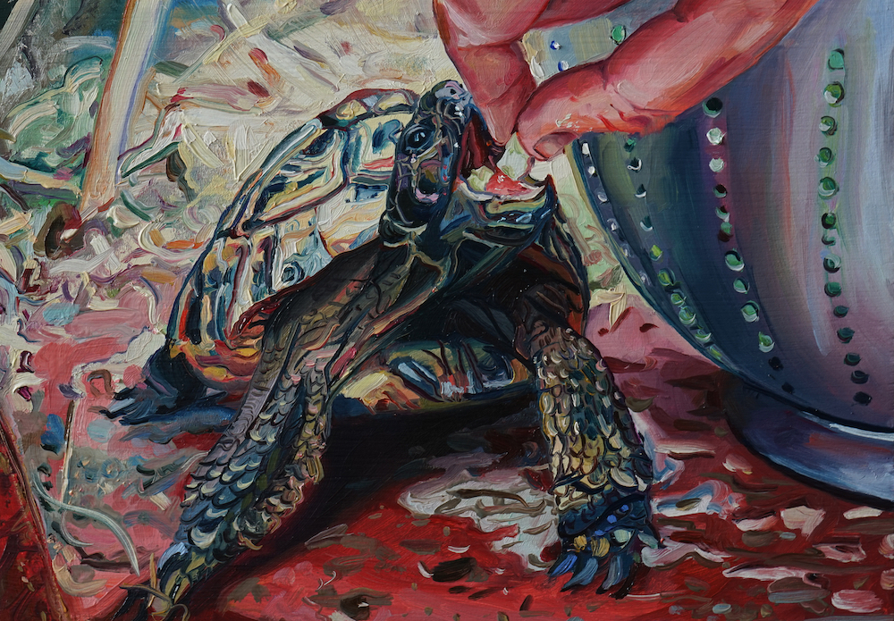
Eve, The Nightmare, c.1899
Paul Gauguin
Monotype, 64.2 x 48.9 cm | 25.2 x 19.2 in.
Collection J. Paul Getty Museum
Contents
What’s The Difference Between A Monotype and a Monoprint?
Approaches to Monotype:
No. 1: Monochrome Linear Monotypes
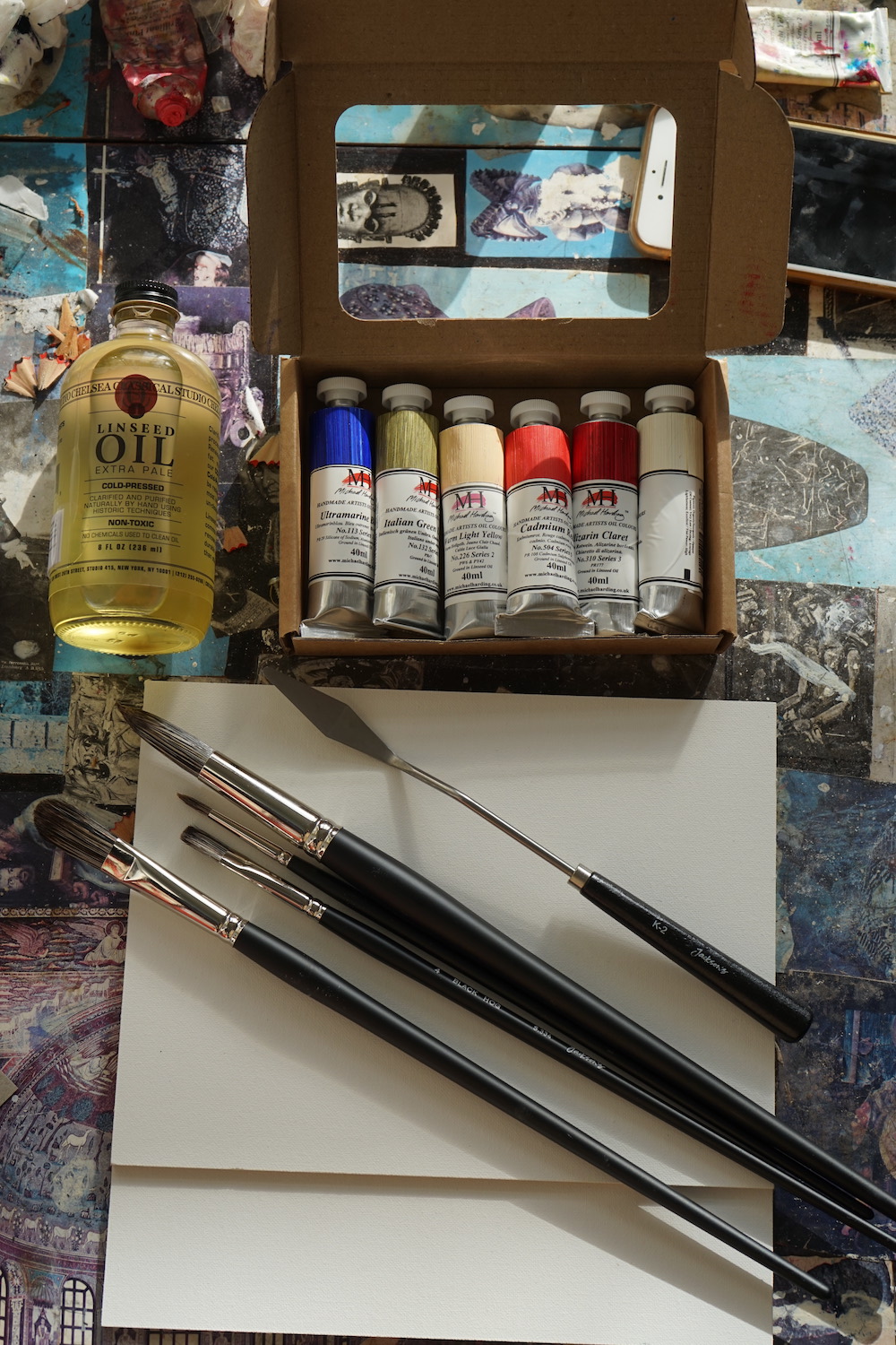
Essential Tools for Monotype

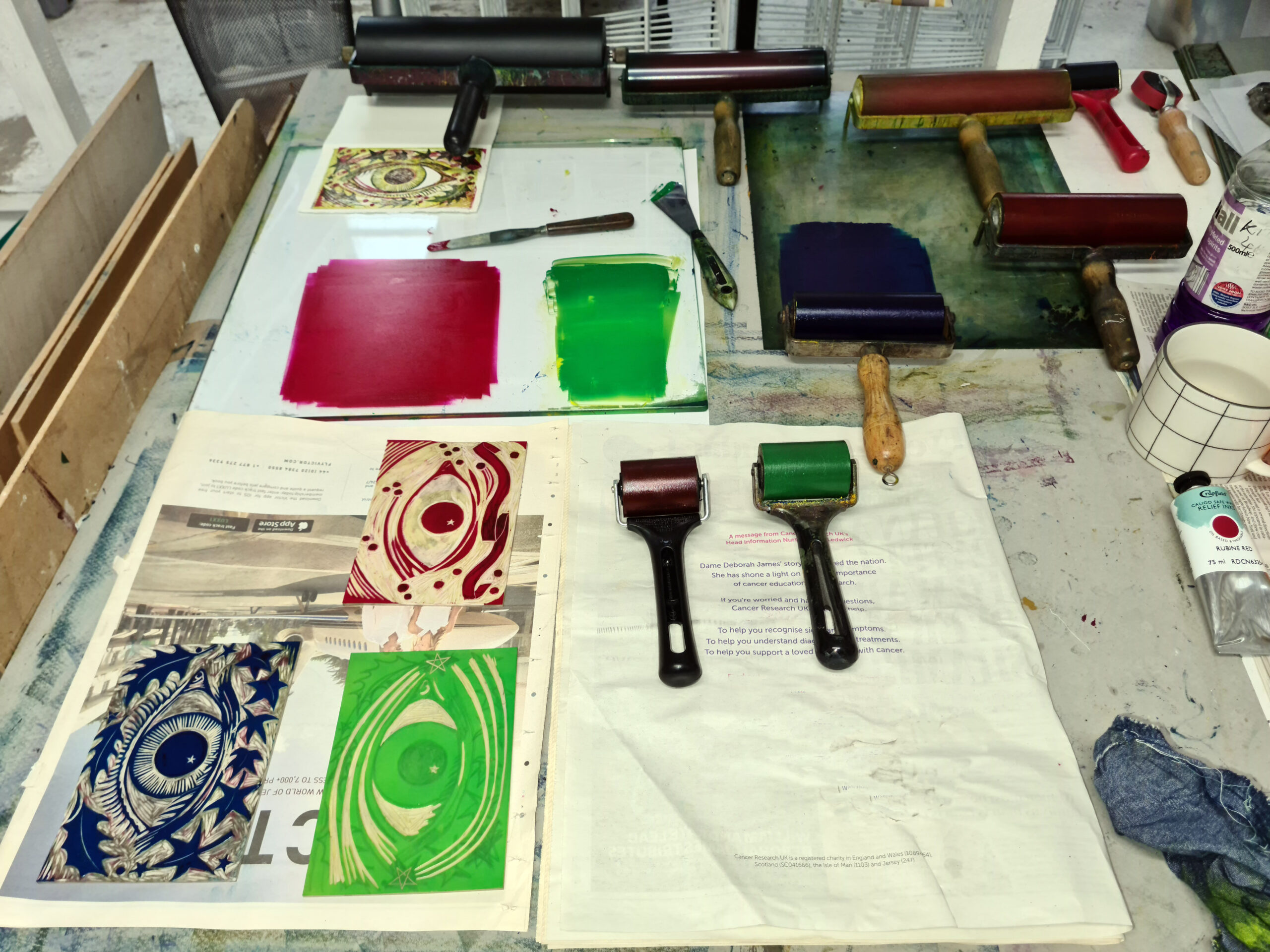
Ink Slab
An ink slab is a smooth, non absorbent surface on to which you can roll out an even layer of ink. This glass ink slab is ideal because you can place guides beneath it when building up a monotype print in layers, to ensure the marks you make line up with what has already been printed. You could also use an old mirror or sheet of perspex, a Gelli Plate or these Grafix Monotype plates.
Roller

L-R: Japanese Soft Rubber Brayer, Essdee Soft Lino Roller, Essdee Standard Lino Roller, Speedball Soft Rubber Roller
You can start monotype printmaking with just one roller, but if you’re making a print with multiple colours, it can save a lot of time to have one for each colour. All of the rollers on this page are suitable for monotype, however I personally favour those with a metal bar over the cylinder as you can rest them on the metal bar when you’re not using it to help maintain the shape of the cylinder over time, and if the roller is loaded with ink, resting it on the metal bar will help stop it getting stuck to any nearby paper or rags. These Handover rollers are longlasting and are a good size for A5-A4 prints, if using multiple colours.
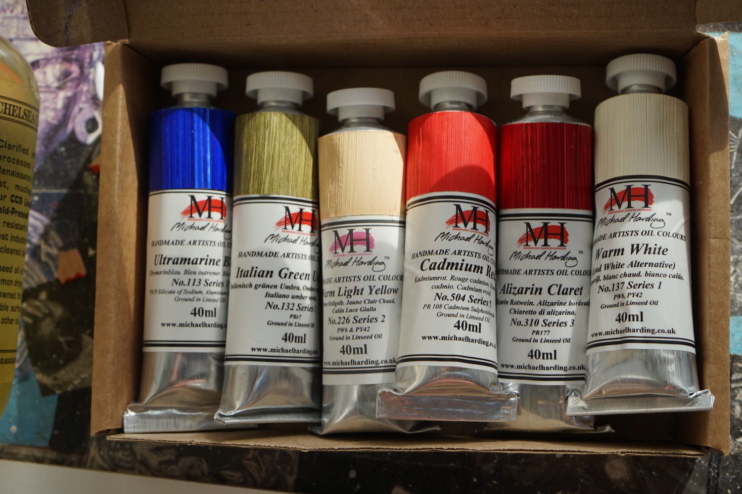
Ink


L-R: Caligo Safewash Relief Ink, Cranfield Traditional Relief Ink, Cranfield Traditional Etching Ink, Schmincke Relief and Intaglio Print Medium
I have known neat oil paint to be used for monotypes but it does not get picked up by paper as easily as printmaking ink. You need that added tack for a satisfying result. Therefore I recommend using a relief or etching ink, and if it takes too long to dry, add a couple of drops of Cobalt Siccative. Caligo Safe Wash Ink is ideal, or you could use a regular oil based or water based printmaking ink. Water based ink dries much more quickly, so is better suited to simple one layer prints. Another option is to add some block printing medium to oil paint, such as Schmincke Relief and Intaglio Printing Medium.
Paper

Regular cartridge paper of around 130-150gsm is smooth and sufficiently flexible to make it easy to manipulate in the hand, and pick up fairly light hand-pressure, so it’s perfect for simple monotypes. If you begin to create multiple layered monotypes, or begin to work with thicker layers of ink, you might find that a heavier printmaking paper will hold more colour, such as Fabriano Rosaspina, Stonehenge or Zerkall. You could also use watercolour paper. Oil painting paper can also be used, but in general, papers that are uncoated or primed tend to hold more ink and will minimise ‘ink squash’.
Palette Knife

L-R: Jackson’s Extra Offset Crank Painting Knife, RGM Extra Large Palette Knife, Jackson’s XXL Painting Knife, Jakar Nylon Plastic Palette Knife
A palette knife is useful for mixing up the ink and putting it on to your ink slab (if you’re working from a tin). It can also be used to scratch into a layer of ink to create texture in an image. A metal palette knife can scratch a glass surface, so if you want to avoid this we advise using a plastic palette knife.
Rags
Rags are useful when clearing up but also they can be used to lift ink away when drawing into ink on an ink slab.
Drawing Tools
Pencil
The sharper and harder a pencil the crisper the line it will achieve, and to combine a sharp and hard pencil with a softer pencil such as a 7 or 8B will allow you to get a range of tones in a single colour monotype.
Brushes


L-R: Silver Brush Grand Prix Hog Bristle Brushes, Jackson’s Black Hog Brushes, Pro Arte Series B Hog Brushes, Bob Ross Brushes
Brushes can be used to paint marks on to an ink slab prior to taking a print – literally any brush can be used for this purpose. If you are using a brush on the back of a piece of paper to add a some imprint of ink to your monotype, it’s better to use a stiff haired brush as you need a greater amount of pressure – a Da Vinci Impasto brush or a hog hair brush is recommended.
Optional Extras
A colour shaper can be used to lift colour from a layer of ink in order to make an image – the stiff ones will lift colour away more easily than the softer tipped varieties. Princeton Catalyst tools can also be used for similar purposes, and offer some interesting mark making options with their unusual shapes.

A variety of marks made by different tools – a Catalyst tool was used for the bottom sweep of uniform lines.

L-R: Flexcut Cutting Tools, Pfeil Cutting Tools, Japanese Wood Carving Tool Set, Essdee Lino Carving Tool Set
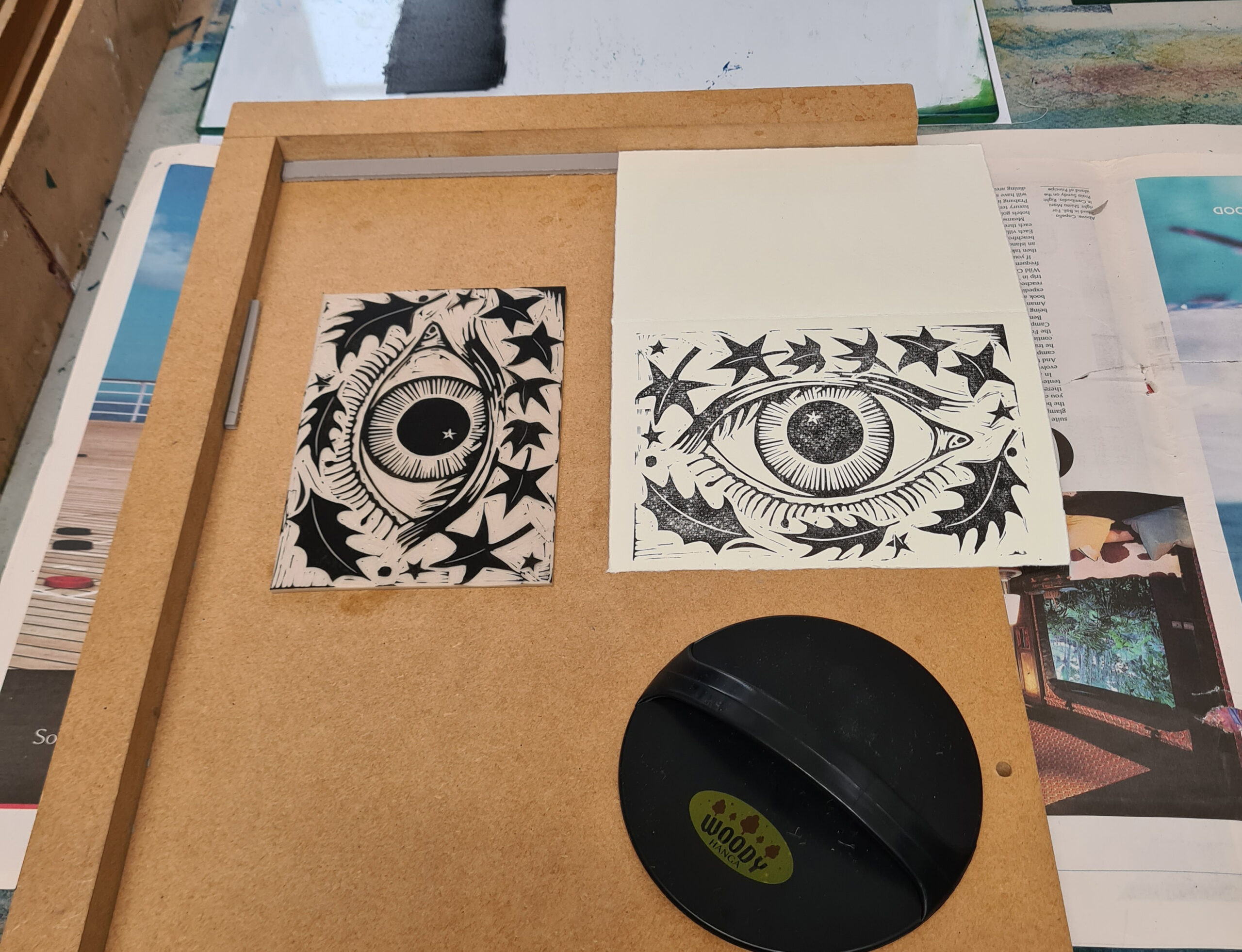
You might consider stamping into a layer of ink to create texture, or combining your monotype with relief print. Speedycarve is best used with hand pressure rather than a printing press so is a good option for when you’re printing at home. If you are adding a relief printing element to this process and using Speedycarve, you will need at least one cutting tool – these Essdee cutting tools are a good starting point as you can explore a variety of blade shapes for an economical price.
Stencils allow you to mask off areas of a print or a layer of ink. If you’re looking for a jagged torn edge you can simply use tissue paper, or if you want a more controlled stencil you could use newsprint paper and a scalpel. Anything thicker is hard to make a good print from, so stencil card is not recommended in this instance. An etching press or similar is recommended as hand pressure isn’t usually enough to get good results.
Collagraph textures can be used to introduce a ready-made or found texture element to your print – netting, lace, doilies, leaves and bubble wrap are all great found materials that could be used for this purpose. This is often a great way to reuse waste materials.
What is the Difference Between Monotype and Monoprint?
A monotype is an entirely unique work of art. A monoprint forms part of a series of prints that each have some variation between them. The constant element throughout the series might be an intaglio or relief print that usually provides a foundation that the variable elements hinge upon. This could be a drypoint or copper plate etching, a linocut, or a collagraph, or a stamp. The way this is inked up or printed might vary from print to print, and there may be some monotype elements or hand coloured elements added to each print to make each monoprint in the series slightly different to the next.
Two Considerations To Remember When Making Monotype Prints
1. Once you have placed your paper over the inked up slab, do not slide it. If you need to reposition it, lift it carefully and lightly drop it into the correct place. This ensures that you do not smear and smudge the ink on to your image.
2. Your resulting image will be back to front, so this is particularly worth remembering if you wish to incorporate writing. You may have seen some back to front writing on monotypes by Tracey Emin – this is the reason why!
There are 3 main approaches to monotype printmaking.
No. 1: Monochrome Linear Monotypes – Placing Paper on an Inked up Slab and Drawing on the Reverse

This method is well suited to quick, one line drawings, as the pressure you apply with your drawing implement on the reverse of your paper will pick up the ink on the ink slab on to which you rest your paper. The most important considerations to remember is to not allow your paper to slide across the ink as the image will smudge, and avoid resting your hand on the paper as you might usually do when drawing, as this will add unwanted ink to your image. The sharper the tool you use the crisper the line.

How thin should the ink be?
If the ink is too thick you’ll get a very blotchy image, so the best practice is to make it as thin as possible and build it up if you need. Half a thumb nail’s blob on your roller is ideal for a 16 x 12 inch print, spread out in a rectangle on your ink slab. The ink needs to be thinner than if you were linocut printing, so you want to ensure there are no dimples on the surface of the colour and only the slightest of hissing sounds as you roll over the colour.
When placing your paper, drop it lightly on to the ink. If you need to move it, pinch it from two diagonally opposite corners and then lift and re-drop, rather than sliding it across the ink and picking up an ink smear. Then, use a sharp point to draw your image. A hard pencil is better than a soft one to get a crisp line, or you could use a biro.
It’s worth holding the paper in place using one finger in the corner of the paper – remember any pressure you put on the paper will pick up ink, so do not lean on the paper with your drawing hand.
You can always lift up the paper to see the lines at any point to see if the pressure you are applying with your drawing instrument is picking up enough of the ink. .If it isn’t consider using more pressure or adding more ink to your plate.

This is the resulting monotype of a succulent. It’s picked up enough of the ink to show the crisp lines of my drawing and a bit of the ink around the drawn lines, which is characteristic of the qualities of monotype.
If you would prefer to prepare your drawing prior to making your monotype using this approach, you can draw it out onto a piece of tracing paper, then place this over your printing paper and tape both over the ink around the edges with masking tape. If you flip the tracing paper over after drawing on it, when you go over the lines with a sharp point to make your print, the image will be created in the same orientation as your original drawing. If you don’t flip the tracing paper over, the resulting image will appear back to front from the original.

If your idea includes writing, make sure you write it back to front, in order for it to appear the right way around!
Using a Hard and a Soft Pencil
You can vary tone by using a soft and hard pencil to make a monotype. These images of the front and back of a drawing of a head show how a tonal pencil drawing can result in a monotype with a range of tones and the soft graininess that is characteristic of the process.

The tonal range of this monotype reflects the tonal range in the drawing on the back of the paper. This monotype was created on one layer of rolled out ink.
Using a mix of drawing tools
By using a range of different tools, you can explore mark making and tonal range. A brush will produce a softer mark, and a colour shaper is capable of a broader but just as dark mark as a pencil. It’s a good idea to dip whatever tool you use in paint or ink so you know where you have drawn.

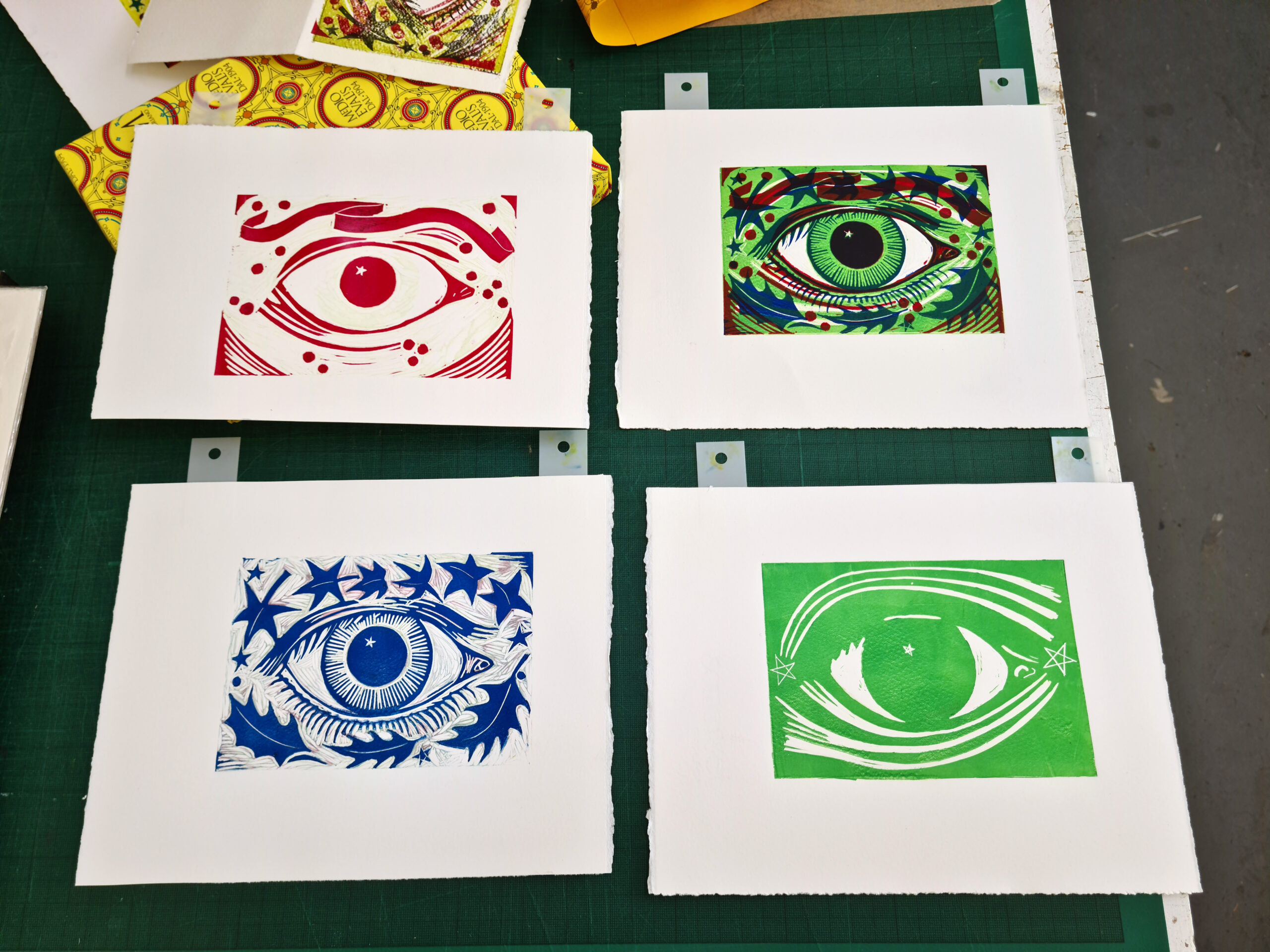
I drew the outline of the Alstroemeria flowers using a hard pencil to begin with. After this I dipped a small flat hog hair brush into some Indian ink and added some shading. It is usual for the ink around painted and drawn lines to be picked up by the paper, so you can expect very soft looking marks. Having looked at the work I decided it needed colour, so I rolled out some violet oil paint mixed in with Schmincke medium and added some shading. I then did the same with some green oil paint to add some foliage. Hopefully what I have done will show how you can gradually build an image up with different colours. What’s great is that if you draw on the back of the paper, you have a record of where your marks are – unlike relief print, there’s no need to worry about accurate registration when you go to apply more marks.

Putting Different Colour Inks on the Slab
You can allow an element of surprise with regard to which parts of the drawing will appear in what colour… or you can be more premeditated by making the drawing first, then placing it beneath the ink slab when you ink up, and then retrieving the drawing from under the slab and going over the lines when the paper is placed over the thin layer of ink.

My portrait was based on a photo found via Google images, which I copied by eye. I ‘felt’ my way around the face while drawing, and the very faint lines I drew on the contours of the face picked up very small amounts of ink, which resulted in some shading effects, especially around the mask of the face. As I moved below the face to the subject’s neck and clothing, the colour changed according to what was rolled out on the ink slab. Varying the pressure of the line resulted in some tonal variations, which was particularly evident as I was working on thinner cartridge paper (130gsm).
No. 2: Painterly Monotypes – Painting the Image on the Slab

One way to start this approach is to apply a thin layer of ink and then use solvent or water (depending on which ink you are using) and a rag to lift areas away. You can also scratch into the ink with a paint brush or pencil. As you will see, the effects of this approach are more painterly than the previous, with plenty of potential for energetic image making.

Once you have your first layer printed, you can then place the print underneath your ink slab to use it as a template for painting on marks for an additional layer to your image, ensuring the position doesn’t change by drawing corners for where the paper is on the ink slab using an Oil Based All Surface Pencil.
I used black as my first colour as it was rolled out already and I wanted to minimise waste, but normally I would advise working with a lighter colour first and adding darker colours, as this can help you avoid getting too dark with your image too soon.

A one colour monotype, made by lifting colour from a rectangle of rolled out ink on the slab, with a rag dipped in solvent.

A monotype made up of two layers of colour. The second layer was made by painting loose strokes of ink with a hog brush on to the ink slab. Monotype brush marks appear more scratchy and energetic then if the marks were made directly on to the paper.
Of course, you can build your image simply by painting on to the ink slab with brushes; you don’t need to roll the ink out first. However it’s always worth making sure your ink is not very thick and impasto as it can make a very smudgy and hard to control mark.
This method tends to use a heavier application of colour, so it would be advisable to use a heavier paper. One with texture such as a rough or cold pressed watercolour paper can alter how marks appear and will help to hold more layers of colour.
No.3: Stencils
Stencils and found textures and patterns can introduce clean, crisp edges to a monotype. Stencils usually require the use of an etching or vertical pressure press, as textured materials may be too thick for the ink to come through to the paper if only applying pressure by hand.

The level of detail can be surprising when trying this process out, and can make some really interesting textures to use in a collage, as well as monoprint.

An interesting decorative layer such as this can form an interesting starting point for a multi-layered monoprint. To give an idea I then tore strips of tissue paper and placed them over the inked up slab. These are very primitive stencils, to block out strips of ink.

By no means a finished image, this has qualities that I feel could be brought into a landscape image – perhaps some trees at night? Hopefully by trying out some of these ideas the process will lead you into some interesting image making! Other interesting ready made stencils include leaves, lace, and doilies. In time regular monotype printmakers tend to develop an eye for potential stencils encountered in everyday life!
Monotype printmaking has the potential to make dynamic and complex prints, or atmospheric sketches with charming simplicity. The process is a natural introductory step for a painter to take into the world of printmaking as it bridges the gap between the painterly and the graphic. Because there is little specialist equipment required, it’s easy to give it a try, and the results can be satisfying and may tempt you to try more. Often a simple line monotype can carry intriguing qualities that a line drawing in pencil or pen may not possess, and then if you start adding layers, and textures, there’s the potential to create a truly unique work of art, or develop ideas that you may want to take back into an oil, acrylic or watercolour painting.

The post Monotype Printmaking for Beginners – What You Need to Get Started appeared first on Jackson's Art Blog.